Fuji Velvia, Provia, Astia, and Pro160
If you’ve arrived from Ken Rockwell’s site then welcome! I’m currently comparing a whole load more films, in fact every colour film available in 4×5 sheet form. If you’re interested in the results, subscribe to updates and you’ll get notified. I’ve another couple of interesting projects soon too.. more later though. Subscribe here if you want to.. Oh! And a big thanks to Ken for the link 
One of the things I have been trying to learn over the last two years of using film is how the different types (at least quickload types) render colour and tone? Which film should I use in which circumstance and which film should I just ignore. I’ve mostly been using Velvia and Provia but recently I picked up a box of Pro160s (prior to my Northumberland Light and Land trip) and a few boxes of Astia from the US (at considerable cost unfortunately).
The majority of landscape photographers that I admire use Provia and Velvia (sometimes 100) and Provia only infrequently. However all of the ‘art’ landscape photographers use Pro160s (or Portra) and possibly the less saturated transparency films like Astia. I don’t like taking things for granted though, I’d rather see for myself (even if the results are as expected). So, over the last few months, every time I have had the opportunity I have taken a picture with alternate films of subjects that I hope will show some of the differences (especially at extremes of colour and light). In this post I’ll show all of the pictures and discuss my interpretation of what I am seeing. I’ll also try to emulate each film by adjusting the results to compensate to find out if I can make Provia look like Astia or Pro160 look like Velvia (as if!)..
Lets take a look at Velvia and Provia to begin with as these are the most commonly used transparency films in large format. I’m using the new version of Velvia and most of the pictures have been taken at the rated iso 50. You can click on any image to get a larger view.
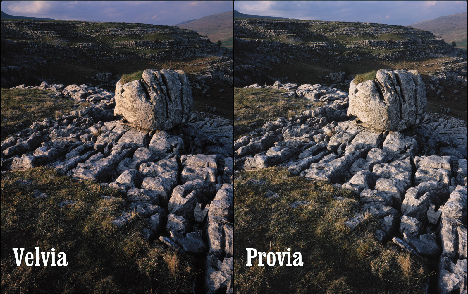
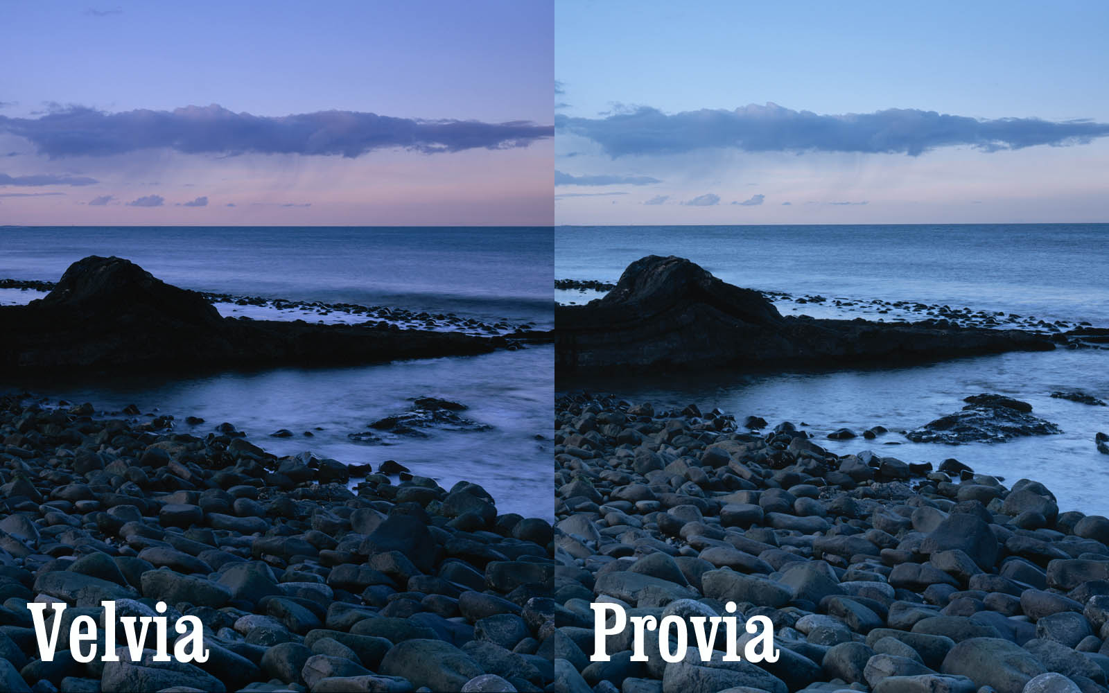
This is a shot I took in the Yorkshire dales with scattered clouds on a blue sky. This isn’t taxing either film particularly. The colours are fairly low in saturation and the contrast isn’t extreme. The differences here are fairly subtle but here are the main ones
- The overall look of the provia version is fairly cyanic
- The provia is less saturated than the velvia.
- The whites of the clouds look slighly magenta on the velvia version.
- The grass in the velvia seems to have a shift to blue/cyan and is darker – definitely more realistic grass in the provia
Interestly we see two different effects here. The overall cyan cast and yet the grass is definitely towards the orangy red. To correct the Provia you would probably have to add a warming filter and then cool the greens back down again.. However, having tried this I then ended up with muddy blues on the provia transparency. The relationships are complex even here.. Overall however, Velvia seems to separate out the magenta, blue and green components of the picture and the greens > blue, whites > magenta. Provia has less colour separation and has an overall cyan tinge, however the greens seem to be least affected by this; Provia has little of the intense sky blue separation seen on Velvia.
This is taken on a very hazy spring day in Scotland where there was a strong visible blue/cyan cast to the world. Because we’re operating in a smaller spectrum of colour, we start to see the difference in film behaviour more strongly. The main differences..
- The provia is intensely cyanic
- The velvia has offered a fairly neutral colour although does carry an overal very slight magenta colouration
- The yellows in the provia are almost acid wheras Velvia has given a rich orangy yellow (more natural to this lichen)
This time the Velvia would be the obvious choice to render a colour accurate picture in these conditions (which goes against instinct). Both films behave sensibly in the shadows (i.e. no extraenous cast)
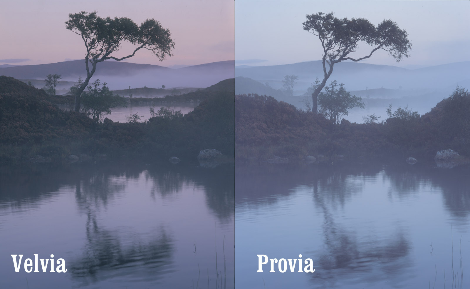
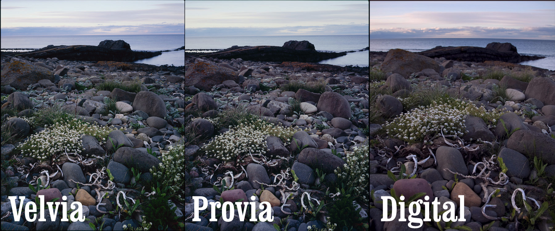
Here we have some very low contrast levels on a dawn on Rannoch moor about 15 minutes before dawn. The contrast range must have been only about +/- 2 stops at most (although some patches of dark probably go -3+). I exposed the frames about mid way so the highlights are a nice +1 2/3. So, to the differences
- The provia shows a strong cyan cast again, especially in the highlights. However, I think I can see a magenta tinge to the shadows.
- The Velvia is strongly magenta in the midtones and highilight but with a shift to green in the shadows,
Here is a version with the Levels adjusted to fix the black points..
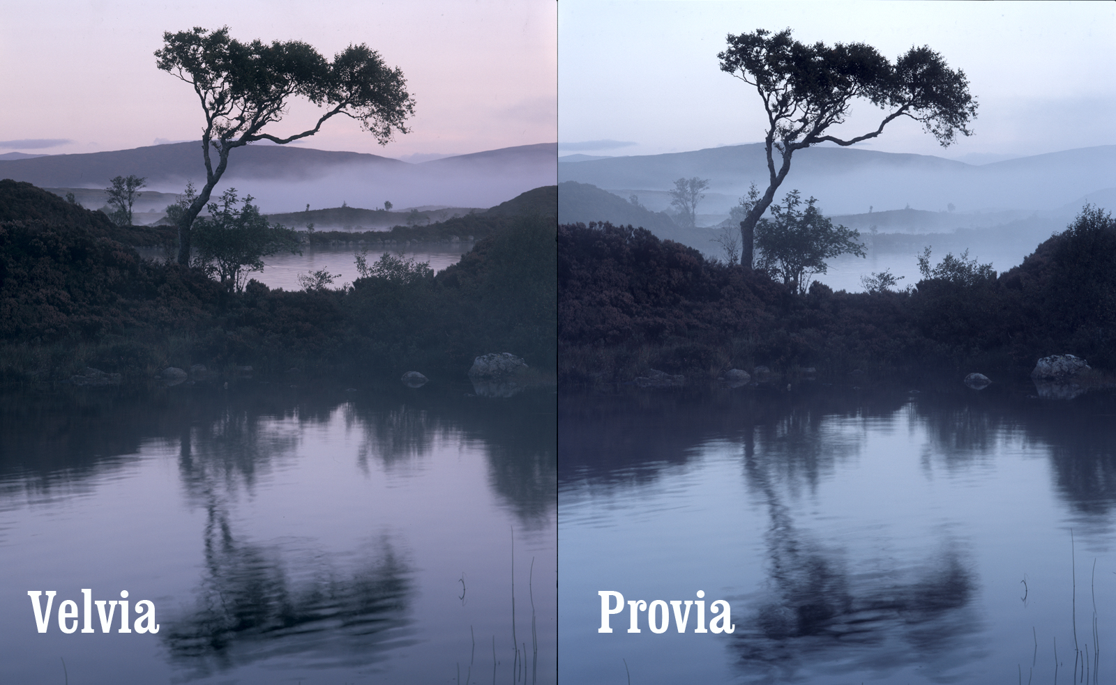
Here you can see the colour cast in the shadows a lot clearer.
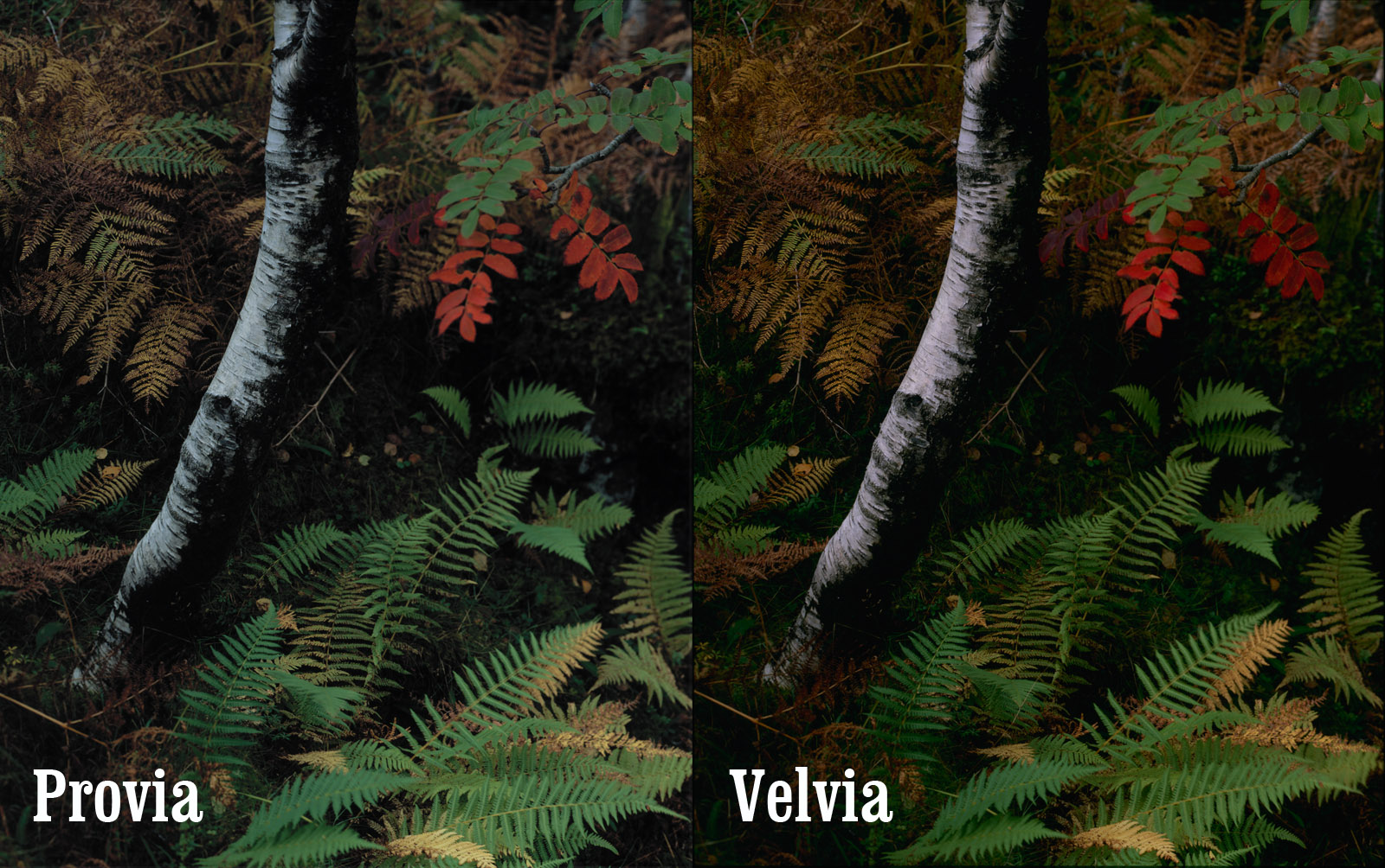
Here is a picture full of bold colour. It also shows some interesting ways in which Velvia treats reds and greens. The reds in particular are increased in contrast. If you look at the red leaves, the slighly darker colours in the red leaves are much darker in the velvia transparency. The digital file of this picture shows a lot more yellow in the ferns and the provia is closer to this – I would probably say that the provia is closer to the actual colour. The digital picture also shows that the reds don’t go as dark as in either the velvia or ther provia. I think red response falls off very rapidly so reds will tend to be either dark or light, maroon or intense pillar box red. So in summary
- On velvia reds roll of in lightness very quickly, dropping to maroons
- Velvia has strongly saturated shadows as opposed to provia where greens can become quite muted in the shadows and also show a warmish shift..
- Definitely more open shadows in the provia
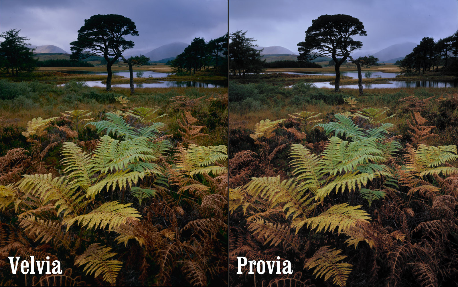
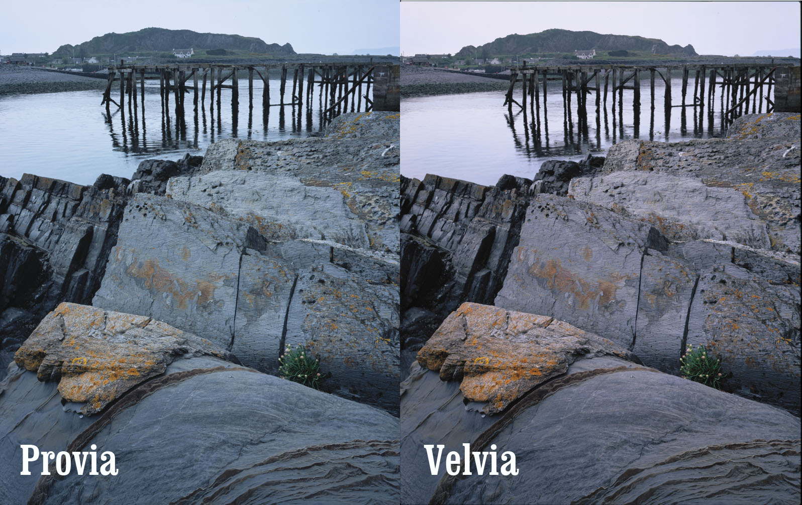
Here is a well exposed picture (at least for me) and it doesn’t show any extreme casts. The provia cyan is till there and we can see the warm greeny blues in the vegetation shadows. The dark red ferns in the provia are almost maroon wheras in the velvia they are a warm orange. Definitely a win for Velvia here..
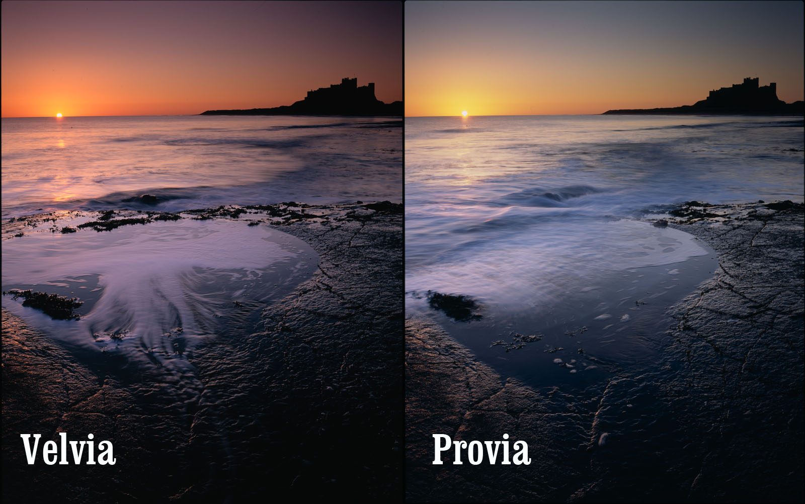
Here we can see the classic velvia sunrise colouration. Provia is behaving very differently here.. It has an intense cyan colouration which needed a strong red filter to bring things back to neutrality. Unfortunately a basic red filter also screws up white balance and destorys some of the green colours. The Velvia has created dark magentas in the sky wheras Provia has turned a deep midnight blue. The truth, again, was somewhere in the middle.
Again though, the films are behaving strategically – colour by colour. This isn’t just a magenta cast and stronger contrast. Almost all colours and shades have their own independant colouration. This is really what makes velvia so special, there isn’t a simple conversion you can apply to a neutral image that will reproduce it. Velvia does respond well to a cyan cooling filter when you have intensely coloured light like this. I’ve tried applying the appropriate colour changes to the different parts of the image knowing that theoretically it’s possible to convert a Provia slide to a Velvia slide. However, it isn’t possible and I think I know why.
Quick side trip into destructive transformations. If we have three colours.. Blue, Green and Yellow and we take two theoretical films.. The first (A) has an affinity for blue and greens tend to look blue but yellows look ok.. Our second film (B) has an affinity for Yellow and greens tend to look yellow but blues look ok. So .. if we wanted to transform film A into film B, what colour do we convert Blue into? Green or Yellow?
Anyway, back to film comparisons..
Here is a photo taken on a cool morning in March. We’ve got no real surprises on the provia and velvia front but we’re introducing Pro160 now. As far as I can understand it, negative film cannot be consistently converted as the different orange masks vary or development is more sensitive or something (someone could explain?) but I’ve kept the conversion parameters in Silverfast consistent so hopefully we have a representative of what could happen. Pro160 is obviously a lot less contrasty but one of the interesting things we can see here is the separation between the cyan and magenta combined with an overall yellowy cast..
More Provia/Velvia comparisons…. nothing new here (unless somebody can see something interesting?)
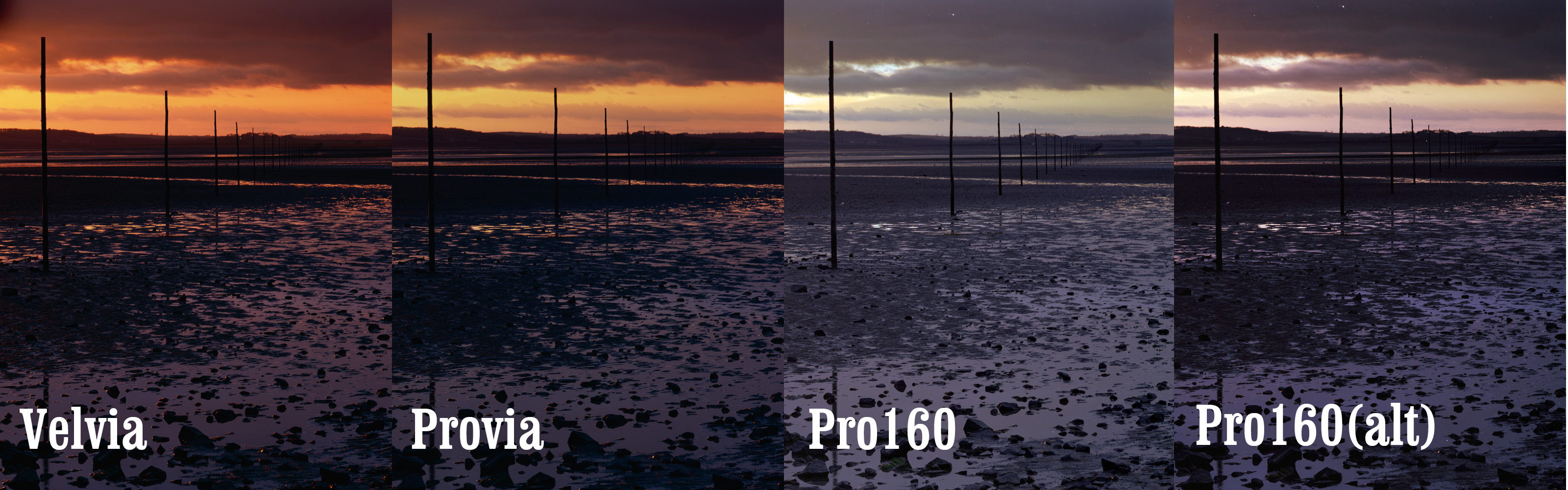
And here is an example of how different conversions of Pro160 can be dramatically divergent.. I obviously need help (DAV!!)…
Astia!
And so on to Astia.. I bought three boxes and an excessive price from Badger Graphic in the US (it isn’t available in Europe any more) and went through a box in comparisons whilst on a family holiday in Northumberland. Well, my opinions are mixed but I’ll start showing you the raw material
Well start with a comparison between Velvia and Astia (with the original digital file for comparison)
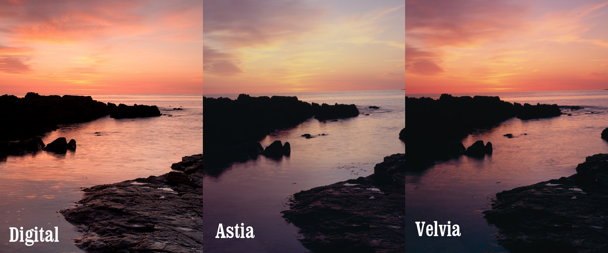
The first thing we see is that the Velvia is more colour accurate than the Astia (compared with the digital anyway). This was quite a surprise! I expected, with all I had heard about Astia, that it would be very close to life like. In fact it seems like, with vibrant colours at least, astia has a strongly unsaturated look and feel with a slight yellow cast. Another surpsise is that it seems to have a magenta cast in the shadows (unless Peak Imaging are having ph problems). That said, I like the pallete of it. I like the way it has created a water colour like feel. I think that where Velvia separates greens and magentas strongly, astia separates yellows and blues (just a theory yet). Here is another comparison of the whole sky once the sun had risen.
oops… I made a velvia/provia comparison and forgot the astia.
This picture at least shows the green shadows in Velvia and the Magenta’ish shadows in Provia
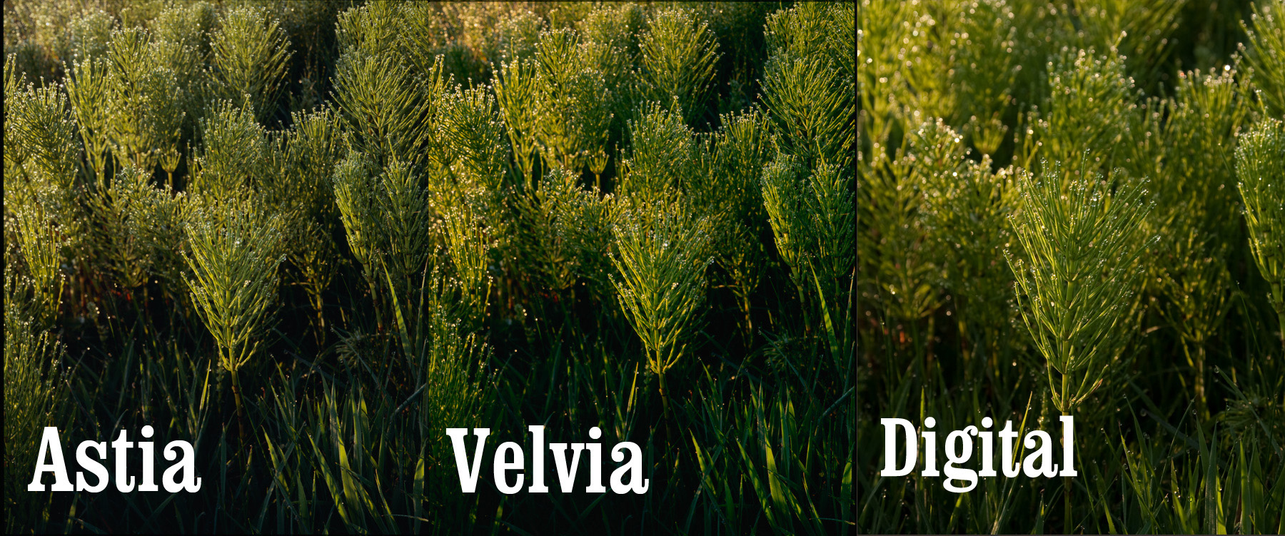
Quite a green comparison here. We can see the classic bluey greens of the Velvia and the Astia has a lack of saturation in the green although keeps a strong yellow component. This makes for a dried out, desert feel to grasses (compared to the rich lushness of the velvia look – which is probably why summer greens with Velvia end up wierd; combine the natural increased blue component with summer foliage and the bluey cast of green colours and you get something quite alien.
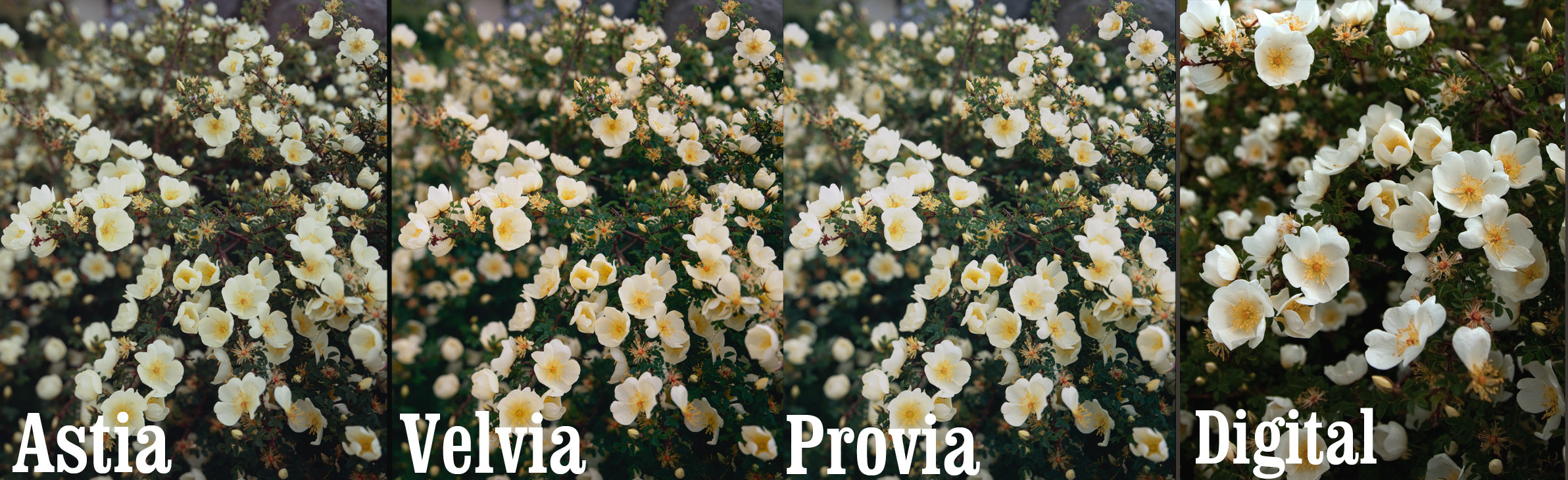
flowers! Here is a nice subtle shot to compare responses. I can see the yellowy cast in the astia, the blue greens in the velvia and a cyan in the provia. The colour in the digital looks a little too yellow from what I remember which I see quite often in digital greenery (obviously too many green sensors).
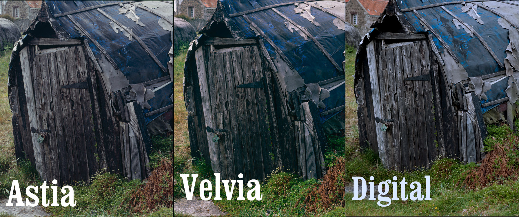
These huts show some wierdness in the blues.. I know the tarpaulin wasn’t greeny blue of the digital and it wasn’t the royal blue of the velvia. In this case the astia seems most accurate although the magenta shadows don’t look realistic – then again neither are the green shadows in the Velvia.
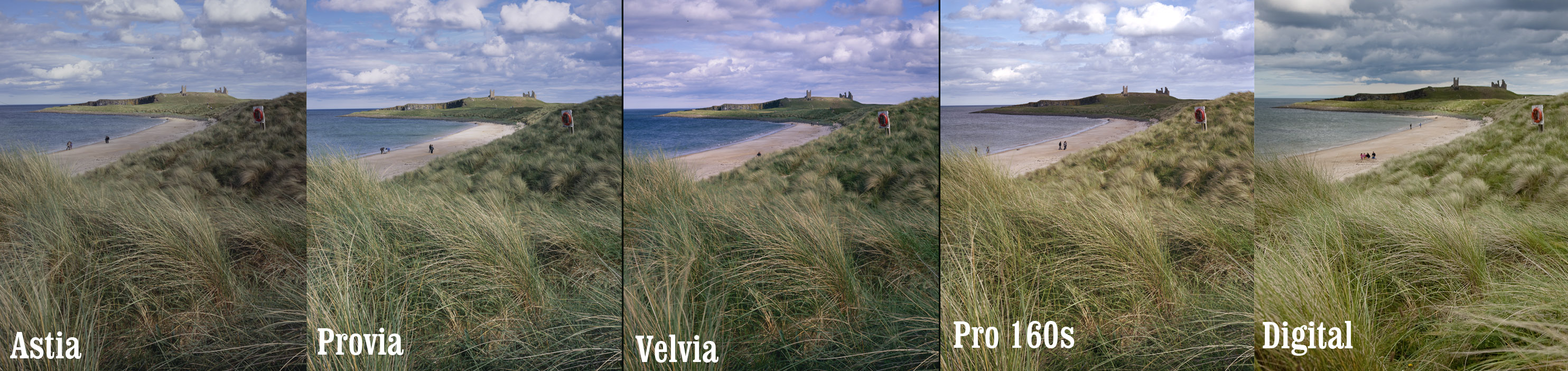
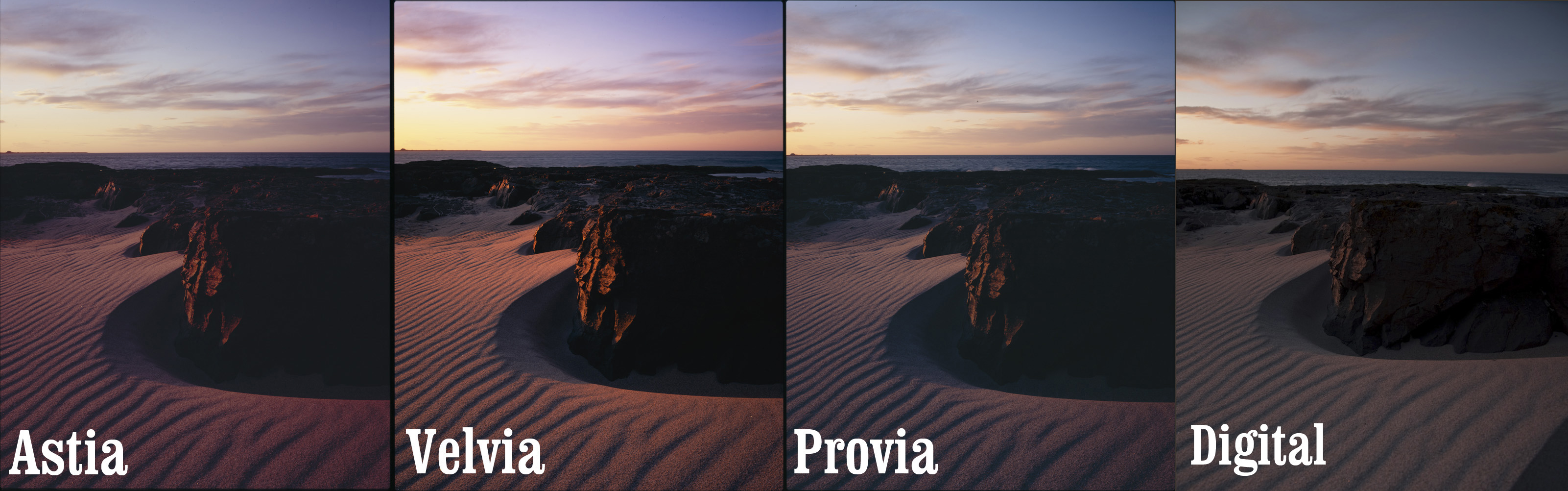
This is a comparison across all of the films I’ve been using. You can see quite clearly here the dramatic separation of blue and magenta cast of the velvia. The provia is looking pretty neutral if slightly cool. The Astia has the same ‘parched summer’ look with some magenta in the dark areas (check the water colour). Pro160 looks quite good but I can never get a nice compromise between too much green or too much magenta – here I’ve gone slightly magenta in the mid tones. Finally, the digital just looks a little alien; the blue clouds and intense yellowy green shadows (in the grass) don’t look natural to me, although it does get the water and beach pretty spot on.
This shows the magenta or green shadows in astia and velvia and the yellow in the astia overall. It also shows the increased dynamic range of astia in comparison to velvia. Finally it also shows the horrible peachy sky that you get with digital combined with the hideous yellowy greens yeuch…
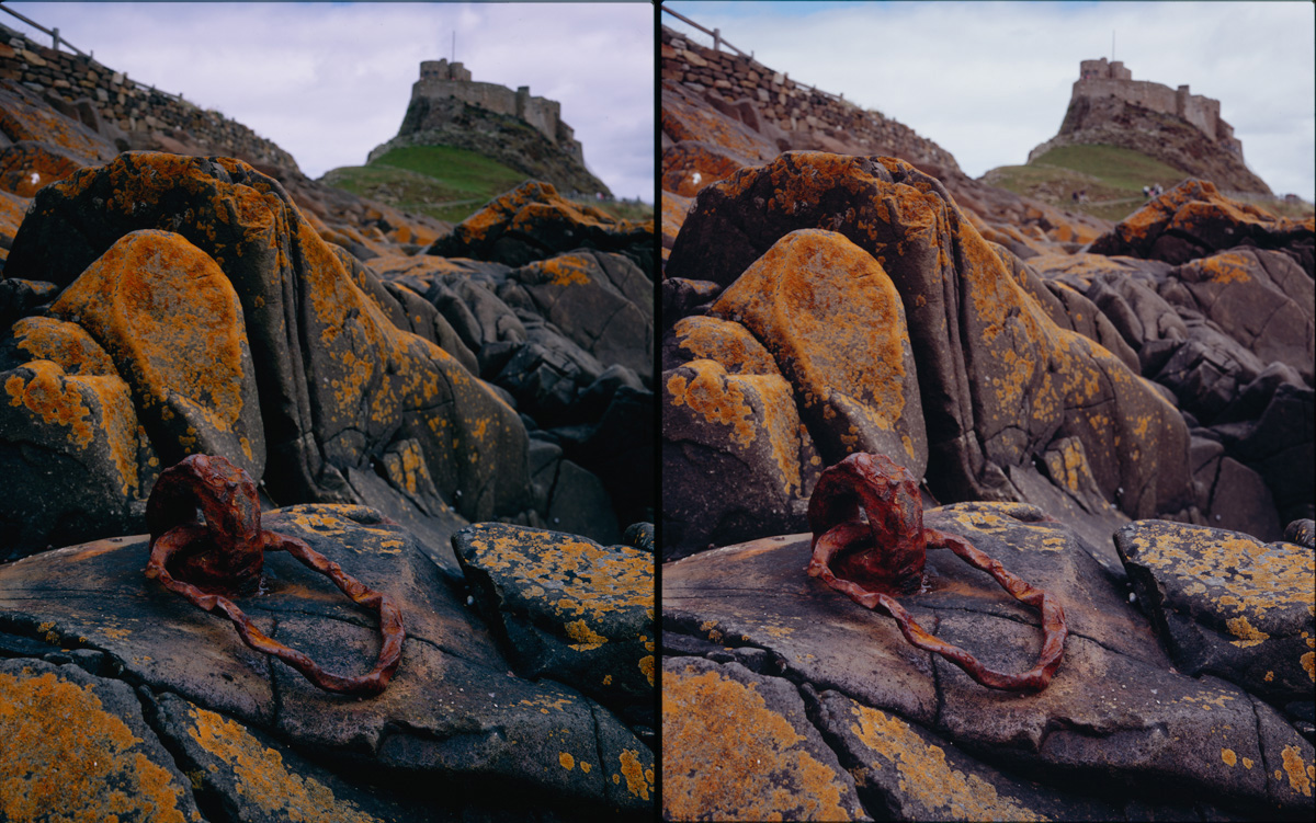
Here is a dramatic image showing the magenta/green differences between astia and velvia. It also shows that astia has got the sky pretty right. Look at the greens though! Velvia looks spring like whereas the Astia looks like the end of summer..
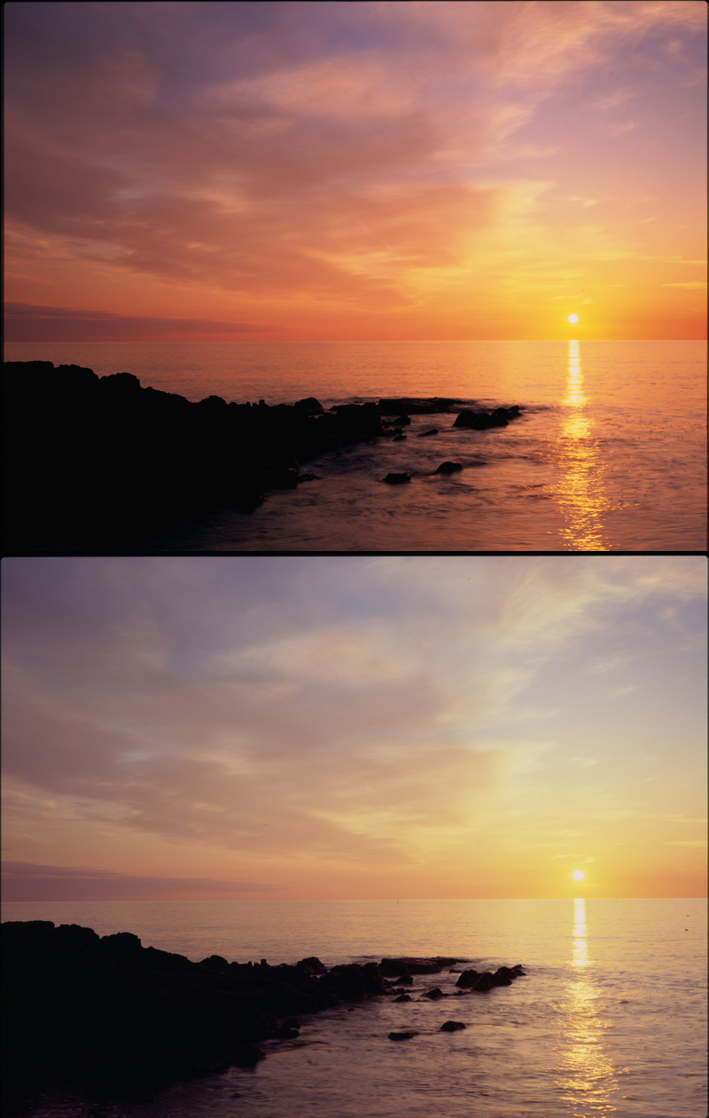
As the sun goes down…
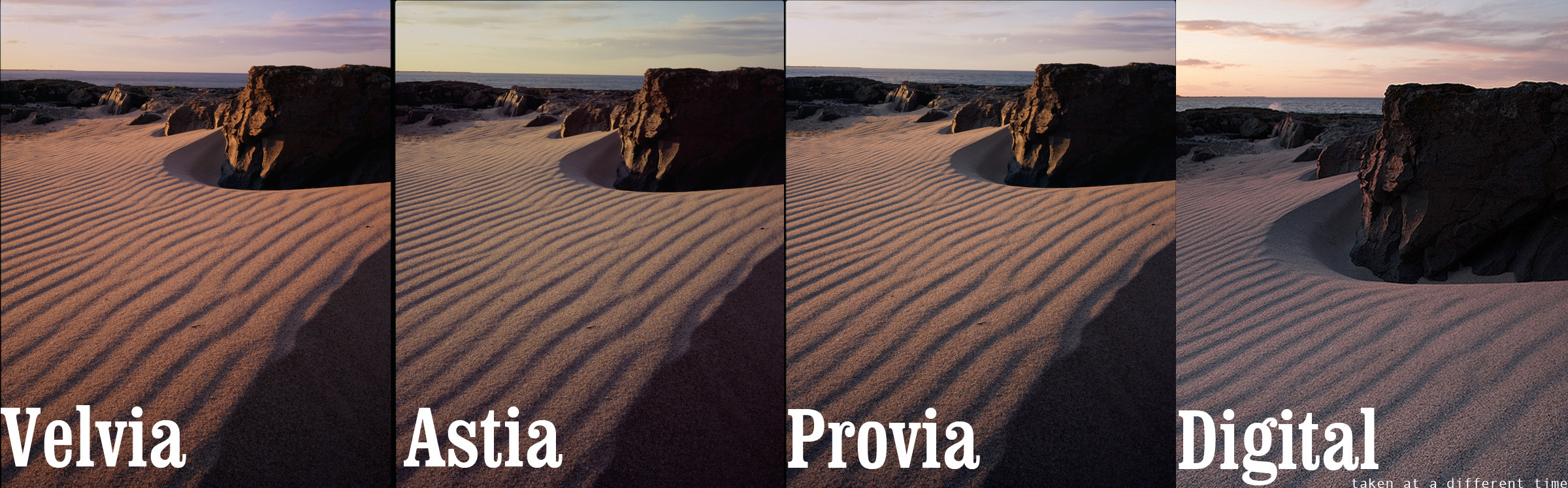
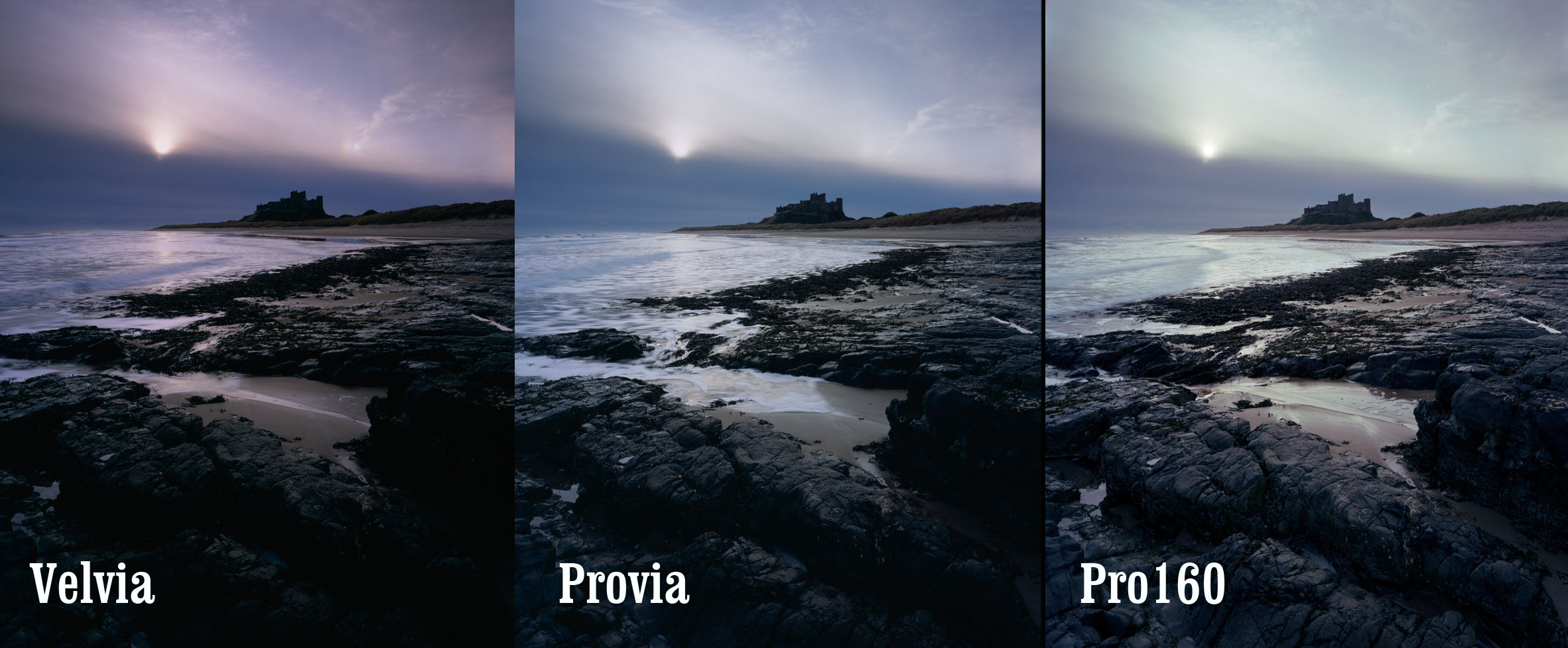
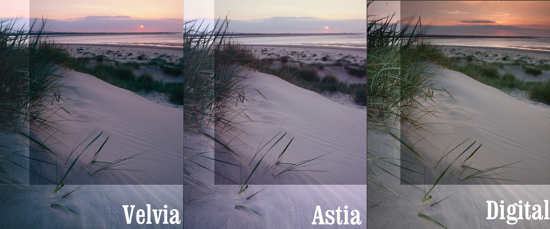
This one confused me.. The sand doesn’t change much between shots but the skies are sooo different (note that the digital ewas taken in shade so it isn’t a good match for the others really). I can’t manage to discuss these pictures too much as I’m all analyticaly burned out… I’ll leave this and the final picture for you to tell me what you see.. These last transparencies are very underexposed (the velvia not so much so).
I hope that leaves you with a good impression of some of the differences between the main large format films being used by landscape photographers in the UK. I would like to try out some Kodak film at some point too. As a final point, it has been said that some of the colour casts I’m seeing may be to do with my processing lab (Peak Imaging) not having their developer at a consistent pH. The next test I am going to try is to send a few of the same shot to different developing labs in the UK. Hopefully this should provide a measure of how consistent we can expect lab processing and how to recognise what is film colour influence and bad processing colour influence.
Please help me by providing your own interpretations of what you see here. The more I can get to know the characteristics of these films, the better I can predict what will happen when faced with a new picture.
UPDATE: Here are some links to other online comparisons…
Provia vs Astia long exposures
UPDATE: I’ve been using some newer profiles so please take a look at the following page which shows how Astia should look when scanned properly click here for a review of profiled scanning on a v750
29 Responses to “Fuji Velvia, Provia, Astia, and Pro160”