Still Developing

" A lot of my enjoyment of photography comes from learning. This is typically done through talking with others, reading books, magazine articles, blogs, etc. Part of the balance of having so much good information available (especially the writings that people make available for free online) is to contribute back by writing anything that I learn or experience. If you get something out of this great. If you care to comment to correct my many mistakes, I would greatly appreciate it. Landscape photography can be a lonely occupation but the conversations we have more than make up for that. "

Saturday
3 May 2008
No Comments

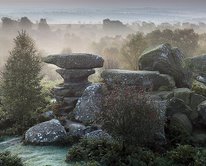
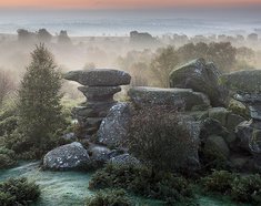
Keld Head Scar and Cheese Press Stone with Nigel Halliwell

Going back a couple of weeks, I had a friend visit to take me out on a couple of days of workshop. Nigel Halliwell is a photographer whose work I have admired since browsing through his photographs online after looking at the Light and Land tutor list. He has a distinct and graphic vision and I was looking forward to working together to see how he interprets the landscape.

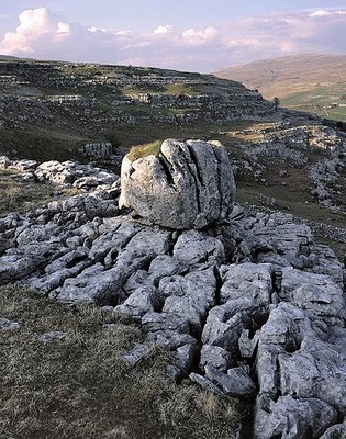
We went out on the Friday afternoon and explored the area on the West side of the Ingleton valley, an area known that looks over Twistleton Scar and Whernside. The particular area we explored was called Keld Head Scar and Cheese Press Stone. Nigel worked on a couple of shots, searching for repeating patterns in the landscape or distince graphical shapes. The Cheese press stone picture in particular is a very masculine shot and one that shows symmetry, repeating patterns, graphical shapes, etc.

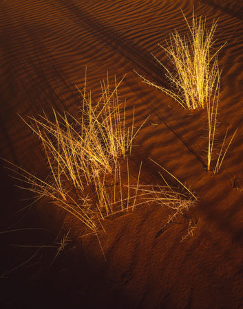
It was really interesting to be out in the field with someone who knows what they want to find and who has a great deal of skill in getting it. As the day went on, we worked our way across quite an area and we both got pictures we were happy with. My picture from the Friday is very different, obviously a lot less graphical and ‘standard’ but I was trying to introduce some graphical structure through the lines in the grass curves at the bottom of the picture.

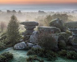
On the Saturday morning we got up early and went over to Brimham Rocks for first light. I couldn’t find anything I was happy with but explored the area with a more critical eye than I had previously which showed many more opportunities than I had originally thought of. It proved to me again that whatever the location, don’t be blinkered by expectations and spend longer looking at each aspect of an area.

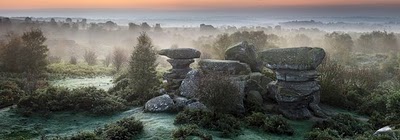
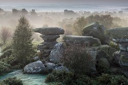
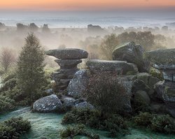
After a brief rest (mornings are soo tiring) we drove back over to Keld Head Scar again and spent a little longer exploring. This time Nigel got the picture at the top of this article and I spent too long looking for something without seeing, writers block as it were.

Nigel showed me a lot about how to see in the landscape and I enjoyed every minute, even the breakfast in Woolworths :-)

Click to view full post including No Comments
Tuesday
29 April 2008
2 Comments

David Ward and Anna Booth’s Exhibition

It’s been a bit of a hectic month since Gower and I haven’t posted as much as I’d like due to scanning, website design, photography trips and exhibitions. I’m going to try catching up on these over the next few days.

The first post Gower trip was to London to see David and Anna’s exhibition at the OXO gallery on the South Bank. I arrived early to see if I could help in any way and chatted with Paula (Pell-Johnson of Linhof Studios), Anna, David and Kyriakos (Kalakortis – http://kkpictures.com/). David tasked me and KK to put up stickers for his prints which we boldy screwed up niceley (how can something so simple go wrong!)..

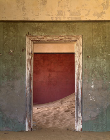
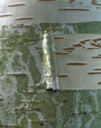
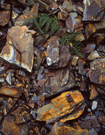
Once the opening time arrived, the throng surged in until the place was so full it wasn’t easy to see the pictures. Fortunately I’d got a good look around earlier on and I have to say that both David and Anna’s pictures were very, very good. I’m familiar with David’s pictures already but seeing them in print (especially the large ones) was a different matter. Anna’s were totally unfamiliar and although her style is similar to David’s in some ways, she has more of an open feel to her compositions and is less transformative than David. My favourites of Anna’s were her Dune Grasses, KMK Doorway, Quarry Fern and, for instant appeal along, Peeling Bark 2

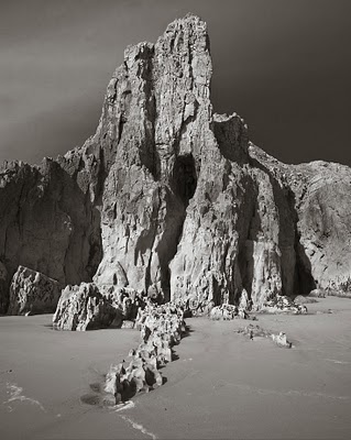
David’s most appealing ones were Boats, Rock Fins, Engineers House and Empty Sea

One of the things that struck me about the exhibition was how well the images worked without frames. The smaller prints were just hung, washing like style, on a wire line running down the gallery walls. The larger prints were mounted on aluminium, printed on epson luster with a matt coating. These prints looked absolutely stunning. They were big enough to really demonstrate the immense detail that the large format image shows and yet were still enjoyable as a whole if you walked a distance away. The sense of depth to the images was intense.

Another thing that struck me is how nice a lot of the people were that came to the exhibition. I spoke to Kyriakos at some length but I also spoke to Richard Holroyd, Mel & Jeremy Foster, Paul Wakefield, Joe Cornish, Roger Longdin, Gerry Gavigan, Nigel Halliwell and many more. My only real complaint about the evening is that it couldn’t carry on any longer!

Click to view full post including 2 Comments
Sunday
27 April 2008
2 Comments

The Black Art of Graddage

OK so there may be no such word as Graddage but it is so important to landscape photography, and especially with transparency film, that perhaps there should be. (“The Black Art of knowing just which grad to pick to get the best transition between maximum effect of the grad to transparent” didn’t quite have the same kick).

This topic was something I wanted to research for a while but an article over at the Singh Ray blog. Darwin Wigget does an excellent job in real world experimentation and the results are enlightening but I hope to add a little to the discussion.

So what is all the fuss about, shouldn’t we just work out how many stops we need and then pick the appropriate grad? Well you could but then you’d have to choose a hard or a soft and you’d better know how fast that transition will happen otherwise what could have been a perfect photo will have a hard dark break in it or you will still end up with burnt out skies.

So how fast does a grad transition from dark to light? This depends on the manufacturer, but with a couple of quick measurements, Lee and Singh Ray filters seem to have a transition for hard grads of about 10mm and for soft grads about 50mm.

The way this transition transfers onto film or sensor is dependant on quite a few things. The main ones I will be looking at are the distance the grad is from the lens, the focal length, the type of lens design and the aperture.

Firstly it’s probably good to mention the possible flaw in the Singh Ray article. The lens that was used for most of the test results was a 17-40mm. This lens is of a design that is peculiar to SLR wide angles. It’s called a ‘retrofocus’ lens and it’s existence is mostly to get around the problem that once you get to very wide focal lengths on an SLR, the mirror gets in the way of standard lens design (e.g. for a 17mm lens, the focal point of the lens would have to be 17mm from the sensor. Not feasible).

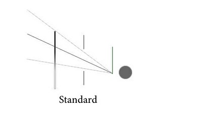
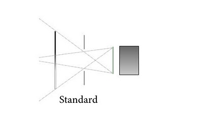
If we look at the diagram below we can see my crude effort to show how a standard lens works and how it ‘sees’ the grad.
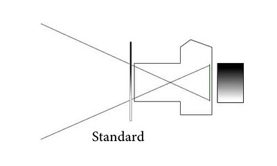
So the distance from the point where the light rays cross to the film/sensor is the focal length of the lens. Here is a wide angle design showing how the focal point is closer to the senor. Notice how on the wide angle design, the transition point is harder.
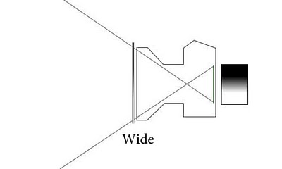
If we now look at a retrofocus design, we can see how the lens rays are moved into a more parralel path (this is also a good thing for sensors as they don’t like having light arriving at them at sharp angles, something Leica know a thing or two about).

Because the grad is so close to the ‘nodal point’ of the lens (the point where the light rays would have crossed if they hadn’t been munged by retrofocusness and other effects – shown on the picture as a green crossing point), the transition is very soft. However, moving the grad a little further away from the lens, by putting it in the last slot for instance, makes the transition harder quite quickly.
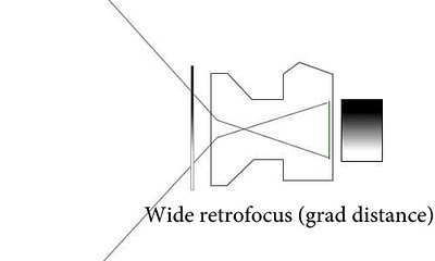
Also, retrofocus design lenses have an aperture that isn’t near the nodal point of the lens.. Before I can explain how this makes a difference I’ll try to explain why the aperture makes a difference in the first place.

So what about long lenses? Well Here we get a little more complicated because some long lenses also play with the light paths and hence the same focal length can have differing hardnesses of transition depending on how this happens. The following two diagrams show a long lens where the first is simple and the second has some juggery pockery going on to increase the aperture.
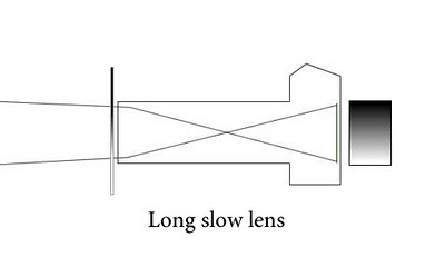
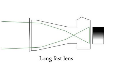
If we have a lens with a very small aperture, we can see that the grad transition is projected accurately through the lens to the sensor/film.
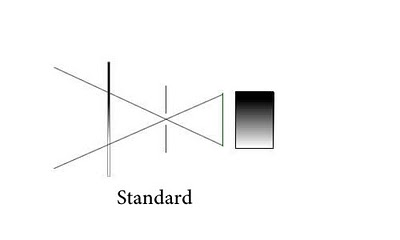
If we have a larger aperture however, the grad is effectively ‘blurred’ (after all it is out of focus). This blur changes the density at the top and bottom of the sensor/film. The following two show how the density at the top of the sensor changes.
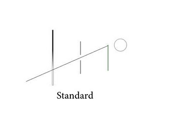
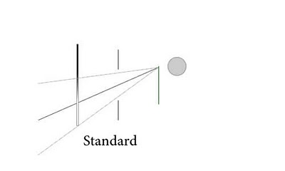
and the following show how the density at the bottom changes
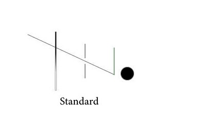
This means the gradient is a lot softer as shown below

The amount of blur is dependant on the width of the aperture (which is focal length / fstop). I’ll expand on this a little at the end.

The aperture in a retrofocus lens isn’t in the same position as a normal lens and doesn’t have the same effect on hardness as on a normal lens. Now I can’t work out how much effect it should have because the lenses are particularly complicated and it may be that I’m wrong in how this affects the transition but it would make sense to use a standard design as well as the retrofocus design in order to provide a balanced result (perhaps someone can contribute?). In reality, it’s good to know that the aperture doesn’t have as large effect on the 17-40 as it’s a very common landscape lens.

For large format photographers, we’re in less complicated territory. The following diagram shows a couple of lenses that I own and I hope to show how the transition hardness is affected across the other lenses I own.
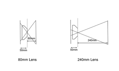
The distance between the lens board and the grad plays a big part in the hardness of the transition as the length of the transition on film is equal to the length on the grad divided by the distance from lens board to grad and multiplied by the focal length. The following table shows this calculation for all of the lenses I own.

All measurements are in millimeters. The transition length is the distance it takes to go from transparent to full density on the film surface. The percentage is the proportion of the film that the transition zone covers (presuming portrait orientation 5×4 film).

You can easily see that on the 80mm, a transition percetage of 13% makes for a hard grad, wheras on the 240mm, the transition zone is 55% of the frame, no good for hard horizon sunsets then.

With soft grads, the 240mm is almost useless.. A 3 stop soft grad would only get the chance to get 2 stops of transition in. On the 80mm, the soft grad has the full transition across 70% of the frame.

This makes Joe Cornishes full range of custom ‘Extra Hard’ grads understandable. I imagine he knows from experience how fast a grad transitions depending on what lens he is using. After doing these calculations I know realise I’ve got a big Lee filter bill coming too :-)

My next job is to work out just how much the aperture affects the transition on my large format lenses.. My gut feeling says that at f22+ it won’t have much effect but I’d like to know how much you need to stop down to get a representative effect (to make focussing easier for instance).

I hope with your new found Graddage skills that the right grad is now a little less of a hit or miss affair.

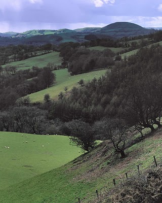
I started the post with picture I took on the way back from my Gower Light and Land trip. I’d stopped at a layby right in the middle of Wales (near Welshpool) and this was the view I was presented with when I walked to the bottom of the car park. I put this image up because it ended up very dark across the top of the land. I’d used a 2 stop hard grad and wanted to stop back the sky but not the land. The picture you see had to be worked on quite a bit to get things back and orderly. I now know that with my 240mm lens, I really need an extra hard grad to accomplish the effect I wanted and the reason that the land was so dark is that it was underexposed by a stop or two because the transition zone overlapped the land by about a third.. I’ll post the original picture up when I get chance.

Click to view full post including 2 Comments
Friday
25 April 2008
3 Comments

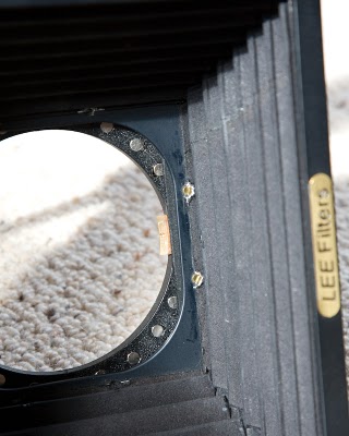
Custom Magnetic Lee Adapter

The picture taken above utilised my latest custom gadget that I’ve been working on for a few weeks. The impetus for the gadget came about when I was purchasing and testing various lens hoods for the Ebony and my range of lenses. I’m probably a little anal about trying to use a lens hood where possible but from the research I’ve done, the case for using a lens hood with a large format camera is a lot stronger than for an SLR or Medium Format one.

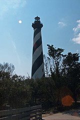
Firstly it’s probably useful to cover why we should use lens hoods at all. The main reason often quoted is to reduce flare if the sun is shining directly onto the front element of a lens. The type of flare that most people think about in these situations is of the highlight flare with multiple reflections, the one that you can simulate in photoshop (if you really wanted to). The following is an example of this type of flare.

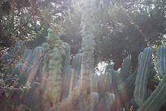
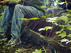
But you can also get less dramatic flare when you don’t expect it, often just because the sun is directly shining on the lens. The article at Cambridge on Colour (great website in general) is very good and shows a diagram of this and the following pictures also show examples..

More insidious however is ‘veiling flare’ which only really shows up as a lack of contrast in the picture. This can be caused by many things from internal reflections in the lens from many sources (so there is an averaging of many point sources to create an overal fogging) or could be caused by bellows flare (excess light entering the camera and bouncing around inside the bellows.

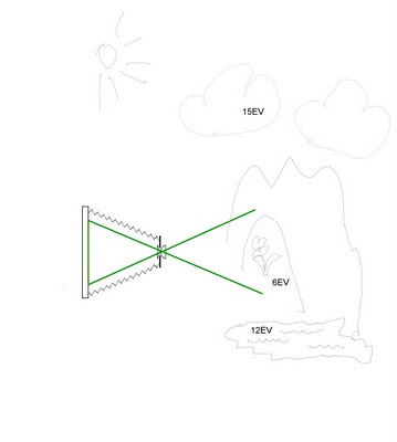
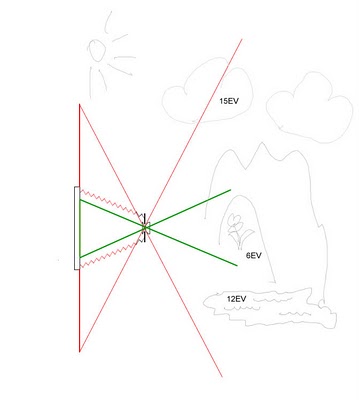
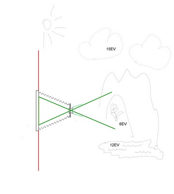
I’ve created a set of little diagrams to show how the large image circle of large format lenses can create bellows flare. Firstly we have an imaginary me taking a picture of a flower in a cave (not something I’ve done by the way) and as you can see, the sun is behind me so there is no need for a lens hood.

However I’m using a lens with a very large image circle. I’ve posted a comparison of image circles before but it’s not unknown for the image circle to be three times as big as the film area (the 110XL for instance). If we look at the what happens if we plot where the image circle goes we get as follows.

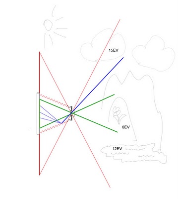
Oops.. we can see that the image circle is taking in the light from the clouds and also the light from the lake in front of the cave. The clouds are at EV15 and the lake is EV12, out flower in the cave is at EV6 so any stray light can easily fog the film.

Finally, if we look at a ray of light coming from the clouds and through the lens, we can see that it is lighting up the inside of the bellows.

Even though the reflections of this light are reduced a lot because of the way the bellows is constructed and the material it’s made of, very bright light sources can very easily fog the shadows of a low light exposure. This will show itself as a reduced contrast over either the whole picture or graduated over one side of the picture. One way of recognising it is that a strip at the edge of the frame will possibly be full contrast because the contruction of the back standard blocks the light from the bellows slightly.

The only way to stop this happening is to limit the light entering the lens by adding a lens hood as follows.

So now I’ve said why, what is it that I’ve actually done. Well.. when I bought a Lee wide angle hood and a standard hood from Robert White. After checking for vignetting using my different lenses, I found that there was no way of using graduated filter with the lens hood without also using a tandem adapter. The extra thickness added by this tandem adapter and second Lee holder caused the 80mm to vignette. The problem being that lens hoods are designed to be mounted square to the camera. If you do this, the slot for a filter in the lens hood can’t be used for grads at any angle other than 90 degrees.

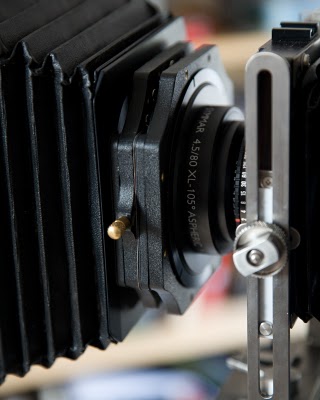
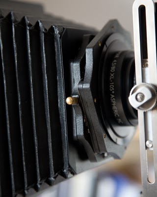
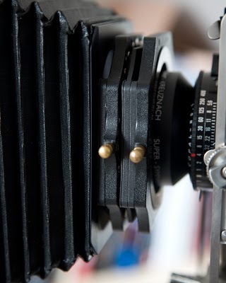
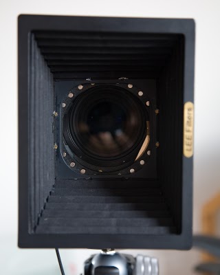
So I got to thinking how I could possibly use the wide angle hood without having to sacrifice grad usage (or be limited to only using grads with a horizontal orientation). I figured the only way I could get it to work is if I stuck the filter on with something like blue tack. Then I remembered seeing an article about a german company that sold super strong magnets. These magnets could hold incredible weights and were only about 4mm in daimeter. So I ordered a bunch of these and after a few hours playing (magnets are really good fun! apart from when your business partner borrows some and sticks them to his keys, forgetting that he has a USB memory stick for a keyring.. oh dear) I started drilling holes in the Lee adapter used on gthe wide angle hood and mounted 24 of these magnets by drilling all the way through the adapter and using araldite to embed them. Then I cut some new adapter wings out of an old biscuit tin and attached them to my Lee push on holder (to fit the Centre Filter of the 80mm XL lens). The result is shown in the following photographs. I’ve also included a picture of my 110 lens mounted with a tandem adapter to show the difference in thickness.

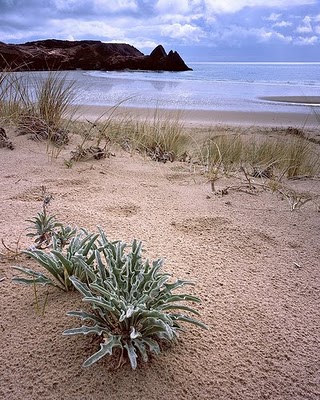
The magnets are strong enough to hold the whole lens hood assembly even when the camer is pointing straight down. One of the unexpected benefits was found out when I was taking the picture of the succulents in Gower. I was using a LOT of tilt and rise and ran into vignetting problems at one side of the picture. However, because the hood isn’t centered on an adapter, I could slide the whole assembly down a bit to line it up with the rise that had been applied. Effectively I moved the whole of the hood image circle down to match the amount of rise I had applied. You can hopefully see this in the image below.

The Light and Land crew were suitably impressed (actually their expressions could have been interpreted as incredulity at my obsessive compulsive behaviour – but I chose not to) and they’ve now challenged me to produce a new gadget for them, a self demisting ground glass screen. I think they may have been joking but ‘I have a cunning plan’…

Click to view full post including 3 Comments
Sunday
20 April 2008
No Comments
Back from a Gower Light and Land Large Format Trip


I’ve just got back (well, OK last weekend was actually when I got back but I’ve been hectic catching up and documenting piccies, sending for developing, etc.) and I have to say that the whole trip was fantastic.

Firstly the Gower peninsula itself is a fabulous place; great geological features, wonderful plant life, nice people and I was blessed with good weather!

Secondly, Joe Cornish and David Ward were wonderful tour leaders. Clever, liveley, helpful and with a good dose of irreverance (mostly from David) to break up the quite philosophical discussions about the art of photography.

Thirdly, it must be something about large format people but the company, 10 folk including myself, was a pleasure to be with.

Fourthly I had loads of fun with my big camera; trying out some gadgets I’ve made (more on that later), borrowing bits of equipment from other people to try and getting to see what other people play with.

I’ve started this post with a scan of one of my favourite pictures from the week, taken on Three Cliffs beach. Those pointy bits are the three cliffs and the plant in the foreground is called “Sea Stock”, a rare succulent only found in North Devon, Cornwall and South Wales. As you can probably tell, there was a bit of a downpour just before this shot was taken but it served to hide some of the foot steps (just).

The photo was taken with my 80mm lens, which is normally very dark in the corners and a bit of a pain to focus. However, I’d just borrowed a spare Ebony ground glass and back from Joe Cornish which was fitted with the Ebony wide angle fresnel. What a difference!! What was black in the corners (unless you move your head) was now a nice even tone all the way across the picture! Also, this meant that it’s a lot nicer to focus. So I gave myself a nice difficult 15-20 degree back tilt shot to test it out with :-) The reflections in the water under the peaks was also a driver for this shot and I had to get about 5 inches away from the plant to take this shot. I used a couple of grads, a two stop with the grad horizontal just below the horizon and a 1 stop that was covering the top right half of the picture to compensate a but for the bellows factor with the plant being so close.

Whilst I’m talking about ground glass though, Joe also showed me his Maxwell screen which was also highly lustable. It’s ‘very’ bright and consistent and the fresnel is hardly visible even under a loupe. Even better, there are no markings on it at all.. Personally I find grid lines and centre circles distracting and to see the picture on a clear ground glass screen which is bright and even was beautiful.. Unfortunately they’re not cheap but as I’ve said previously, the time I spend behind the ground glass is one of the moments I really enjoy in life and if anything removes my disconnect with the subject and increases this enjoyment, even better.

The Light and Land courses are wonderful and I can totally understand why people keep coming back again and again (in some cases taking 3 or 4 courses a year for over 7 years!).

My next course is hopefully in Glencoe in January of next year and I’m already getting excited :-)

Click to view full post including No Comments
Saturday
19 April 2008
1 Comment

Launching a New Website (No not my own!)


Quite a few things have been happening over the last couple of weeks. I’ve launched a website for one of the UK’s (and possibly the world’s) finest landscape photographers, been on a course in Wales with this person and another of the World’s finest landscape photographers, created a couple of product customisations (magnetic lee filter and waterproof quick disc that works in the dark) and bought some new equipment and books.

Trying to write up the whole lot in one block is a little daunting so I’m going to spread them out over the next week or so and accompany them with some pictures taken whilst in Wales.

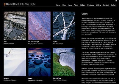
Firstly there is the website I’ve built for David Ward, a photographer I particularly admire and one whose best work had no representation in the public domain. A little back story first though. I went on a photographic holiday in the Hebrides with a company called Light and Land last year (pictures posted on some of the first posts in this blog). The leader of the course was David Ward who had brought some work to show people and who also made a big impression on my understanding of why I take pictures. I was very surprised to hear that David didn’t have a website and mentioned to him that I’d be happy to build one for him if he was interested.

Over the next few months, as well as immersing myself in large format photograph (damn you David) I also designed a look and feel for the website and planned out content and how it would work. The site was launched two weeks ago and most of the bugs seem to be ironed out now. Have a look at http://www.into-the-light.com and let me know what you think. Your feedback will go directly into the website if it’s good!

I personally am very happy with the results and the decisions made to get to where we are.

Some of those decisions are fundamental to how we photographers portray ourselves on the web. The biggest decision is the size of images which I will be discussing in my next blog post.

Click to view full post including 1 Comment
Saturday
19 April 2008
7 Comments
How big should my web images be?

One of the first key decisions I discussed with David was how big should we present images to the user. The influencing factors on this decision are as follows

  • Portraying the highest quality images to the user
  • Ensuring that the images cannot be missapropriated

The balancing act between these two factors will give us a size at which we are happy to use. In order to assess these two factors I will go into some details about each one.

Portraying the highest quality images to the user

We all wish to capture a level of detail in our images that goes well beyond the resolution of a computer screen. When we come to represent those images to a user we shrink the images to a point where we don’t think they are of any use to ‘pirates’. This typically means shrinking them to where they are also of little use to most users.

The typical size of a web gallery image appears to be about 300px x 450px , a size that is poor even by cheap mobile phone standards. I’ve yet to meet a photographer that would happy to show there hard graft to a potential customer or browser on a cheap mobile phone and yet most will proudly talk about their new website and how well it shows there work.

Most professional cameras/scanners these days will produce files of approx 4000px x 3000px and if you are working with large format files, 6000px x 8000px and more is not unheard off. This means that the average size web image is showing 1.1% of the image that was taken or, if you are of the large format persuasion, 0.3% of the image is shown. In my personal opinion as someone who likes to browse other peoples work, this is a real shame.

A typical photo oriented monitor these days (i.e. one of about £250-£300) is approx 1680px x 1050px which means the little picture at 300px x 450px is only taking up 13% of the screen!

Let’s think about what resolution image we would have if we were to try to make the most of this common screen size. For a portrait image on an SLR, this would be 666px x 1000px . If this were to be printed up at 300dpi, we would have a 2.2″ x 3.3″ picture. Even if we were to print this at a just about acceptable 150 dpi, we would still only have a 4.5″ x 6.6″ picture which would make a lowish resolution postcard printed using sRGB colour which has a low colour range.

So, if we are happy to risk the possiblity that someone will print out a picture postcard sized print at low quality of one of our shots then we can provide screen filling goodness for our customers and browsers!

Portraying the highest quality images to the user

OK, so now the down side of putting images on the web. People can pinch them and use them for personal use or possibly to make money for themselves. This is obviously a serious matter. The general ethos at the moment in photography is to try to make sure that there can be no piracy at all by making the picture too small to be useful. We should also consider that this will inevitably mean a reduction in possible sales as people cannot see the product at it’s best.

What we have is a classic cost/benefit problem for which there is a ‘best’ point at which the additional sales gained by having higher quality images is overtaken by the actual losses caused by picture piracy.

Wait a moment though, we need to work out a way to calculate the actual losses due to piracy. I’ve spent quite a while browsing around the web and asking colleagues about who has actually lost revenue from this problem and I could not find anybody who said they were personally worse off because of piracy. There were a few people who had found there images being sold elsewhere but those sales did not reduce the photographers actual sales (in fact, when the pirates customers found out in one case, they licensed the photographs from the original photographer!).

Lets take a look at this from the eyes of a potential pirate. We can probably classify them as ‘personal users’, ‘small time opportunists’, ‘career fraudsters’ and ‘organised crime’.

I think we can discount organised crime here because they seem to have other ways of making lots of money. I also think we can discount career fraudsters as if photographers have problems making money out of their own pictures, it’s not really an attractive fraud opportunity. So we’re left with personal users and small time opportunists. The personal users aren’t costing any money but I can understand that some people object to unauthourised use. The opportunists are the real problem but generally they only cost the photographer money once the photographer has discovered what is going on. At that point, it’s up to the photographer to take action and prove the opportunist has broken the law.

The people I have spoken to who have said this has happened have mostly said it’s been for use on websites or for little pictures in articles, in which case, the 300px x 450px is more than usable for this.

If an opportunist really wanted to pirate material to make some serious money and costs the photographer revenue, they could order original prints or buy rights managed or royalty free pictures and pass them off as their own. No amount of web asset size restriction will prevent this.

Now my ‘boat’ is landscape photography so some of the discussion I’m having is probably not relevant to the photographer who makes money out of selling stock images for web use; but for most art ‘style’ commercal photographers, I find it difficult to beleive that the availability of a postcard size images will create serious revenue loss.

However, as I’ve said, I can see revenue loss from a lack of good product representation.

So this conversation was had with David and the conclusion was to go for screen filling goodness. There was one precaution I wanted to take though.

Final Precautions

The Internet is being ‘crawled’ by search engines all of the time and you can use google or other tools to find lots of images without having to browse through lots of websites. Hence it is more than likeley that images will appear somewhere on the web without the associated copyright footer.

This presents a ‘plausibly deniable’ opportunity to a fraudster. They can say that they found the image on some search engine and didn’t know it was copyright restricted.
In order to get around this, all of the larger images on David’s website have a footer attached in the same background colour as the site (so that it doesn’t appear to get in the way of the picture). If the image gets indexed by some search engine and then gets picked up by someone wanting to use it, the image still has a footer which includes copyright statement and contact details. The fraudster would have to manually remove the footer and this gives any prosecution the evidence to prove active ‘intent’ to remove copyright notices.

Some Last Points
People always ask about watermarks to prevent theft but I generally think that making an image unusable also renders it almost unusable as a promotional tool.

The postcard comparison came about when I saw the Fuji promotional material that includes high quality postcard size images of some of David Ward, Joe Cornish and Charlie Waite’s best work. If this isn’t seen as a piracy opportunity, good size images for web use shouldn’t either.

I’d love to hear about other opinions on this matter though so please let rip.. :-)

Click to view full post including 7 Comments
Wednesday
26 March 2008
3 Comments
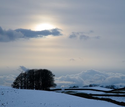
A Snowy Lakes in Easter

Easter usually isn’t the time of year that you would usually want to be in the Lakes but for personal reasons we were making the trip anyway. My parents have a caravan just outside Windemere and we drove over on Easter Sunday morning in blanket snow conditions.

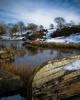
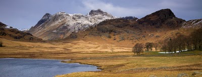
The weather warnings (typically hysterical) must have put people off as there were very few cars on the road and when we went for a walk on the Sunday, we only saw a couple of people. There were so few people that myself and my Dad thought we’d risk a drive over to Blea Tarn on the Monday morning. The picture at the top was taken after spending a good 2 hours looking around a small tarn for interesting compositions (the one with the boat was the best I found). We decided to finish things off and go for a drink thinking that was it for the day. Upon leaving the pub, this view greeted us from the front door, a quick draw camera action grabbed it just as the ‘interesting’ cloud diffused the sun.

We got to Blea Tarn in sunny conditions and walked up from Dungeon Ghyll to Blea Tarn ( a 45 degree climb of only about half a mile but with 58lbs of gear it’s pretty hard on the legs).

You have to understand that Blea Tarn is a mecca for photographers for the two reasons that make Lochan Na h’Achlaise a mecca, great view, 50 yds from a parking spot. We only saw six photographers this time and the weather wasn’t great but we did have a great walk.

On the way down, the legendary Lakes weather shut everything down from a sunny day to 50m visibility in about 5 minutes.

Overall a very enjoyable trip and a couple of OK shots.

Click to view full post including 3 Comments
Sunday
9 March 2008
No Comments

Playing with Polaroid

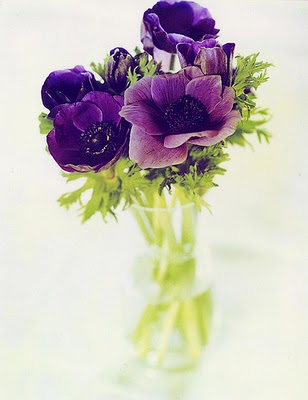
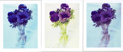
Went for a little walk this weekend but it wasn’t particularly indusive to photograpy so when I got back I took out the Polaroid film I’d received over the last week and played with comparing type 59 with type 79 (yeah, really useful now it’s redundant). Anywy, the results made me realise that type 79 is a lot more resilient to long exposures.. here are the results

The left image is type 59 unfiltered and the right image is type 59 with an 81D..

The centre image is the feature image on the article as it’s the most realistic but I quite like the almost cyanotype look of the 59..

The exposure was 10-20 seconds (longer for the type 79 picture as the sun was dropping and it was taken inside but with ambient light).

The picture is cropped too tight because the 4×5 polaroids lose about a quarter of an inch on each side.

Tim

Click to view full post including No Comments
Friday
7 March 2008
No Comments

Lens Format Equivalents pt III – Ilustrated

I’ve put together a few images to illustrate a scenario of format equivalents. This example uses an extreme example of someone starting on 4×5 who wants to move to 6×17. The options we discussed were 1) using the ratio of the short edges 2) using the ratio of the long edges 3) using the ratio of the diagonals..

First of all here is the 4×5 sample shot.. we’ll presume this was taken with a 150mm lens

The ratio of the long edges would give 120mm (for the 4×5) to 170mm (for 6×17) which is 1.4:1 – so if we were to use a 210mm lens we would get the following

If we use the ration of the short edges we us 95mm (for the 4×5) and 60mm (for the 6×17 we get 0.63:1 – so we use a 94mm lens and get …

finally we try the ratio of the diagonals 1.17:1 which gives 175mm which gives

Now I would think it fairly obvious that the typical choice would be to scale by the short sides… But this is just one instance and hence it’s wise to know why a choice is made..

Let’s take a look at 35mm to Large Format conversion.. firstly here is the 35mm picture taken with a 35mm lens…

The long side ration is 36mm to 120mm which gives approx 1:3.3 which is a 116mm lens.. (nice length on 4×5) which would result in this picture

If we use the short sides, we get a ratio of 95mm to 24mm which gives approx 3.96:1 which gives a 138mm lens..

Using the diagonal gives a ratio of 3.5 to 1 which gives 122mm lens.

Which of these makes sense…. Well

1) if you are used to cropping your pictures already, the short edge comparison recreates this. 1:3.96 (~4:1)

2) if you like to get a lot of forground and background in portrait mode, then you’ll want to get the comparison of the long side. 1:3.33

3) if like the amount your current lenses encompass width ways (on a landscape orientation shot), you should use the long side conversion. 1:3.33

Click to view full post including No Comments