Still Developing

" A lot of my enjoyment of photography comes from learning. This is typically done through talking with others, reading books, magazine articles, blogs, etc. Part of the balance of having so much good information available (especially the writings that people make available for free online) is to contribute back by writing anything that I learn or experience. If you get something out of this great. If you care to comment to correct my many mistakes, I would greatly appreciate it. Landscape photography can be a lonely occupation but the conversations we have more than make up for that. "

Thursday
6 March 2008
3 Comments

Saturation and Reality – Why Velvia?

Velvia 50 is a favourite film of landscape photographers worldwide, so much so that when Fuji shut down production because of materials issues (the Velvia was on it’s own dedicated line using difficult to source materials according to Fuji), the uproar was enormous. People stocked refrigerators full of the stuff. When the head of Fuji was at a large gallery exhibition and asked what films were being used and he was answered “Every one of these pictures if using Fuji Velvia, the one we’ve just shut down the plant for”… or so the probably apocryphal story goes. Whatever happened, Fuji pulled all the stops out and created a new version of the film using the new common production plants. The film is that popular that there are lots of photoshop plugins and extensions just to replicate it (probably the only film that has software specifically named after it).

Why do landscape photographers love this film so much though? It’s not realistic at all, the colours are lot more saturated than in real life so you would imagine people who love the land would want to represent it as it actualy is. Some photographers hate Velvia, it’s true, and it can certainly look horribly overcooked in the wrong conditions. There is something about a scene taken using Velvia that is just more ‘natural’ .. more how we remember it.

So let’s do some research (I’ll do it for you) into how we understand colour and saturation. Firstly, we don’t actually remember colour – we aren’t wired up to be able to do this. We remember symbols for colour. For instance, if I show you an golden delicious apple, you see it and then your brain remembers ‘normal looking green apple’ not R 81% G 75% B 17%. When you try to recollect the colour, your brain goes normal looking green apple and pulls out it’s memory of what a normal looking green apple should look like. This is typically more saturated than the actual time really was. The brain also plays all sorts of tricks with these colour memories. The image below shows my guess at what a golden delicious colour is combined with the results of two photographs taken from google images and a painting of a bowl of golden delicious apples. My guess is the most saturated of them but it’s interesting that the painting is the second most saturated.
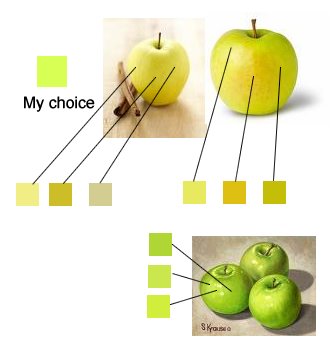

This increase in saturation is common in a lot of paintings – at least if we filter by the time period that had access to the full colour spectrum of oils/acrylics/etc – a lot of old oil paintings have not only faded but they didn’t have all of the colours we take for granted now. Looking at 19th century landscape art is probably a good example. Yes there are artists who have tried to carry on using the ‘old masters’ aesthetic, but more common is to see this ‘idealisation’ of colour.

Research has been carried out that supports this also, the following links are just a few samples.

Choosing highest saturation for color name
http://www.humboldt1.com/~cr2/colors.htm

Article About Memory Color
http://www.isisimaging.com/MemoryColorPaper.pdf

Accuracy of Hue and Saturation recall
http://www.perceptionweb.com/abstract.cgi?id=v96l1008

The main research I remember I can’t find a reference to at the moment but the study showed people an abstract chip of colour. They were asked to memorise it. They then were asked to pick that colour from a selection of different hues and saturations. Quite soon after the event, the people were fairly accurate. After a day, the participants chose a slightly more saturated colour. After a few days, they chose a more saturated colour that tended toward the nearest primary colour.

So is Velvia actually a better representation of how we remember things? If I have experienced the lakes on a beautiful spring day with pinky purple sunset and then a year later see a photo of that event on Fuji Sensia and another picture on Fuji Velvia, which one will be most like my memory of that event?

Another idea is that we as photographers develop an eye for colour that perceives and remembers colours that are in real life quite muted. It’s these perceived colours that we want to show to the outside world, not the actual colours that were really there…

Discuss….

Click to view full post including 3 Comments
Wednesday
5 March 2008
7 Comments

Lens Format Equivalents Continues

The subject of lens equivalents has come up on Large Format Photography mailing list recently and I thought it a good time to come up with the definitive answer to the 35mm to large format (4×5) ratio.

The first thing was to make sure we really know the size of a large format and a 35mm photography. Well I thought this would be easy but there was a surprise in store. The 35mm size was not 35mm (but I think I knew this). The size was actually 36mm x 24m (35mm was the size of the width of the film strip).

You would expect large format film to be 4″ x 5″ but actually it’s not this, it’s 3.74″x4.72″ (or 95mm x 120mm). This means the aspect ratio is actually 1:1.26 and you lose over 10% of the film area you thought you had :-(

So… the ratio between LF and 35mm can be calculated based on three things. The first is comparing by short dimension. This is the method I use as I used to crop my 35mm pictures to 4×5 and I now use a mask. This preserves the short dimension of the 35mm picture size and doing this gives a ratio of 3.96 to 1.

The second way to calculate the ratio is presuming that if you like the amount of landscape you can include with your 35mm camera, you should use the long dimension as as the ratio. i.e. if you decide you want to take a landscape orientation picture and you stand in front of Buachaille Etive Mor and want to get the whole mountain in, then you’ll want to get the whole mountain in with 4×5 too.. So you’ll need the longer side of the aspect ratio to convert properly. This gives a ratio of 3.33 to 1.

The ratio that most people use however is the diagonal. I haven’t seen a single justification for this apart from “It uses bits of the short and bits of the long dimension”. Anyway, this gives, 3.54 to 1, which is probably the ratio a lot of people recognise.

In summary: –

short dimension comparison gives ~ 4 : 1
long dimension comparison gives ~ 3.33 : 1
diagonal dimension comparison gives ~ 3.5 : 1

Whilst I was doing this I also used google docs spreadsheet program to calculate a few more things, like what lens distribution would you get it you use 40% spacing of focal length and worked from a 150mm lens? What ratios do Leica and Nikon recommend (based on a posting at LFP.info)? What happens if you use 40% difference in angles instead?

Visit this google spreadsheet to see my calculations.. If you want a copy of the spreadsheet just ask or I think you may be able to copy it from the google site.

I should say that the common consensus seems to be to choose your lenses so that the spacing is approximately 40% by focal length. If you want to carry less lenses, use 50%.

As an example from my spreadsheet. If we start with 150 and 210 as a couple of focal lengths that have a lot of common lenses in, we get the 40% ratio and the extrapolated focal lengths in this range would be 77, 107, 150, 210, 294, 412 or if we map to real lenses this would be 75, 110, 150, 210, 300, 400.

I chose to use slightly longer spacing at the top end and slightly shorter spacing at the bottom end. Thinking about this since, I think it might be more useful to have closer spacing at the top end. The reason is that most uses of longer lenses are to pick out details at a distance and it’s harder to ‘use your feet’ when you are working in a 3D environment, for instance if you are on the side of a hill looking down a valley, moving 30% closer to the other side of the valley changes your viewpoint somewhat. My lenses are 80, 110, 150, 240, 360, 500 which give ratios of 40%, 40%, 60%, 50%, 40%. The gap between 150 and 240 is a bit long, I could do with a 190 or 200 to plug the gap but my pack is heavy enough as it is :-)

Joe Cornish uses (from the first light book) 58, 72, 90, 120, 150, 210, 300 (although I doubt he uses all of them at once!) which gives 25%, 25%, 33%, 25%, 40%, 43%. The steps are longer at the top end which is probably because these lengths are used a lot less frequently by Joe (although by his own admission he rarely takes out the 58).

Click to view full post including 7 Comments
Saturday
1 March 2008
No Comments

Large Format 24-105 equivalents

I’ve said in a previous post that I use my Canon 5D as a finder for my Ebony 45SU. Before now I’ve used an approx guess at 4x the difference in focal lengths in order to choose my lens. Today I tried out converting these settings by eye, trying the large format lens and then finding out the focal length that would be the equivalent in 35mm.

So the conversions I found were (based on a focus point of approx 4m )

The 80mm lens can be checked by using with long dimension of a 4×5 cropped 5D viewfinder to check the short dimension of the 80mm..

I’ll have to try infinity focus equivalents next.

Addendum:
Infinity focus tested – results updated in image

Click to view full post including No Comments
Thursday
28 February 2008
No Comments

More Lee Lens Hoods

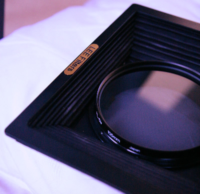
As a follow on from Lens Hoods and Filters, I received a standard hood (one slot) from Lee yesterday and tried it out with my various lenses when mounted on a 2 slot holder with tandem adapter as long as you don’t extend it fully (extension of about 12-15cm). All of the other lenses (240, 360, 500) work fine with any amount of filters and at full extension.

As far as polarising filters go, you can pull the standard hood to full extension, drop the filter (not mounted on ring) into the front of the hood so it nestles in the last but one fold of the hood and then close down the hood a little. This holds the polariser safely and work with the 150mm lens.

The standard hood comes with front slots but be warned that they cannot be used for normal filters. They are a bit wider (115cm) and so can only be used with custom made filters/masks. I tried a custom mask for my 360 which had a 2×3 inch(ish) hole in it but slotted into the holder. Whether this level of masking is really necessary is questionable. I shall have to do some more experiments.

extra:
I found an article that seems to suggest that my idea of masks to limit the image circle to only that necessary for the picture may have some merit. Follow
this link to an article by Robert Zeichner
.

Click to view full post including No Comments
Tuesday
26 February 2008
No Comments

Lens Hoods and Filters


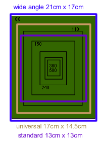
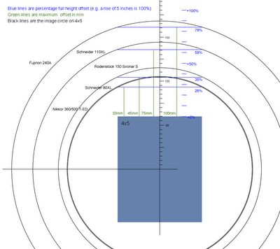
So I’ve got a Lee Filter set (which I’m very happy with) and would like to buy a lens hood that will provide suitable flare protection (I use a flag at the moment but I’m thining about all that non-image forming light bouncing around in the camera, especially with lenses like the 110XL and 240A which cover about 4-6 x the area that is used. (see diagram below for the amount of extra light your camera receives – format of image plagiarised from Schneider docs)


Lee offer three different hood options. The wide angle hood, the universal hood and the standard hood. I bought a wide angle hood off ebay for a good price so this is the first I am working with. (By the way, thanks to Tre at Robert White for measuring the hood sizes)

This hood will only really work with the 80 and 110 lenses so my criteria are:

1) 80mm + centre filter + alignable grad + warming + polariser + hood.

The first 2 items mean using a push on filter with a 100mm hole and a 100-90 bushing. This is fine. I add two slots to this and use a tandem adapter to mount the wide angle hood (configured with one slot). Bad news… This vignettes in the corners. Now I have mounted a polariser ring on the inside of the wide angle hood (it was a good fit) but this doesn’t seem to make the problem much worse.

Just as an experiment, I tried using 1 filter holder on the push on and attached it to the lenshood with blue tack. This works a treat even with the polariser mounted (although I’m getting very small corner crops which I think are curable by using a slimline polariser (I’m using the Lee 105 polariser at the moment which is very thick).

I’ve ordered a bunch of very powerful 1mm thick magnets which should allow me to mount filter holders very close to each other and at about 30 degree intervals (enough for most very wide work I imagine). We’ll see where this leads.

2) 110mm with/without centre filter. The above solutions works a treat with the standard layout.

3) 150mm lens. This should be fine with the WA Hood but would be better with the standard hood. (see diagram at the top of the page)

4) 240/360/500 – I think that these would be best accomodated by adding masks to the front mount of the standard hood.

The main problem then is solving the 80mm lens issue. If I can manage a solution for this, then the rest of the lens fit niceley. Lets hope some magnetronic jiggery pokery works.

Click to view full post including No Comments
Tuesday
26 February 2008
5 Comments

Updated Pentax Zone Sticker


After working out my idea for a zone sticker customised for Fuji Velvia, I asked quite a few people about what the dyanmic range of Velvia 50 is. The responses I got were varied but most people agreed that if you want real detail, you want to be +1 2/3 to 2 stops above and if you want shadow detail you want to be -2 stops.

However, the feedback I got from Joe Cornish was that it really is a long subject which needs more than a quick response but in short, Velvia 50 responds well to reds and yellows and not so well to blues and cyans. This means that when you take a shot into the sun, you can get texture up to +2 1/2 and colour up towards +2 2/3 to +3 .. Cyan and Blue however start to go clear at +2 1/3 and if you want texture, you need to be using +1 2/3.. Wow! Something I think will be very useful. At the bottom end, the feedback is that Velvia will record black detail down to -2 2/3 (although you need a drum scanner to get it out) and -3 will go hard black.

I’ve modified my sticker accordingly but will try to have a longer conversation about this in the future. In the meantime, if anybody would like one, I’ve printed off a few extra if someone wants to send a stamped addressed envelope to Tim Parkin, 237 Lidgett Lane, Leeds LS17 6QR; I’ll send a couple back.

Click to view full post including 5 Comments
Sunday
17 February 2008
5 Comments

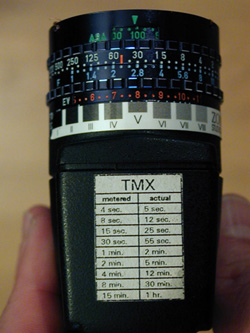
Pentax Digital Spotmeter + Mod

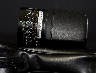
Up until recently, I have been using a Sekonic L-558 Dual Master which has been accurate but ultimately unsatisfying and often annoying in use. My main complaint about the Sekonic is that it doesn’t make it easy to use the zone system and to check relative exposures. Pretty much every large format photographer of note tends to use the Pentax Digital Spotmeter (PDS) or some equivalent (e.g. a simple EV meter with a mechanical calculator).

The advantage of the mechanical calculator on the PDS is that it makes it simple to look up alternative exposure settings. It’s also very easy to apply offsets.

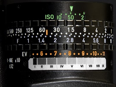
The only missing part of the equation is using the zone system (if you can’t find a neutral grey, you can’t use the default exposure reading). There is a sticker made by Zone VI which shows all of the zone levels from 1 to 9. However this only really works for high range black and white film with a dynamic range of 8 or 9 stops. (The picture below is from a review of the Zone VI mod at http://www.butzi.net/reviews/light_meters.htm

With Velvia 50, you only really have 5 stops of range, which with a bit of research I’m presuming is +2.3 to -2.7. So what is a person to do? Make my own that’s what! So I made up a template using Macromedia Fireworks (after measuring the width of a stop on the meter and the depth of space I could use). The following is a jpg you can use to print out if you like).

Once this was made up I printed it out on stickyback paper and then covered the top with a strong, clear sellotape (for water and smudge resistance). Clipping off the corners to try to stop it getting knocked off and it all seems to be OK.

The idea is that you find a part of the scene you want to be a certain zone and take a measurement from it. Then place that EV reading against the zone on the sticker.

NB: I should add that the in the photo above, the scale isn’t centred on 8 and hence it looks like zone XI is 2 2/3 rather than the 2 1/3 I intended it to be.. I should also add that I’m not 100% sure that 2 1/3 isn’t totally transparent (I’ve got a feeling it probably is – or rather even if it’s not, if you read 2 1/3 with a light meter and there is any texture, the highlights will be above 2 1/3 and hence totally transparent)

Click to view full post including 5 Comments
Sunday
17 February 2008
No Comments

Trialling new equipment at Ingleton

Given the great weather (for walking, if not for photography) Charlotte and I drove over to Ingleton to scout out the top of Twistleton Scar. I also wanted to try out some new gear I’ve acquired, namely a Gitzo tripod and a Pentax Digital Spotmeter (with my V50-Zone mod).

We arrived at about 2.30pm and with a little bit of out of fitness huffing and puffing we got to the top and looked around. There are only a few trees around the top (a lot less than you’d think given that nearly every picture up here has one or more in) so it’s lone tree syndrome by default I’m afraid. There is, however, a fantastic variety of limestone pavement, ranging from very flat planes to sharp clints and deep grikes (clints being the solid bits and grikes being the gaps).

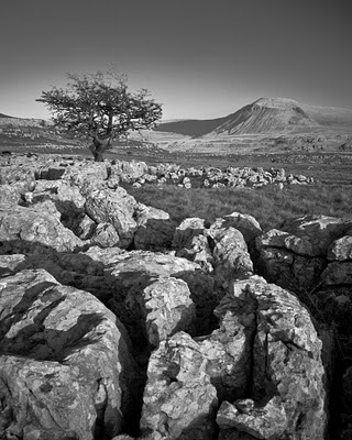
A very niceley positioned tree gave me the opportunity to compose limestone foreground with a rounded edge into the tree and then Ingleton peak in the background. Unfortunately the lighting only really left black and white as an option. One to come back for though.

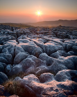
As we walked further over the top of Twistleton, the sun started setting and a wonderful golden glow highlighted the tops of the clints. In one particular section, the clients were rounded and shaped like lobes of a brain or coral reefs. This became the picture you see above. I did take a large format shot but the sun was dropping so fast that I think I missed getting the golden highlights. The Spotmeter was wonderful to use and the V50-Zone sticker made working out exposure a lot easier.

The new tripod is definitely a lot more stable than my old Velbon but the steel spikes have one disadvantage (although it might be an advantage in disguise). It is more difficult to position the legs with the spikes fitted because of you don’t have the spike at right angles (or with 10 or 20 degrees of a right angle) to the rock it’s resting on, it does stand a chance of slipping. So getting a sturdy position for the tripod takes a moment longer. However, I have the feeling that the ‘stickiness’ of the rubber feet has been hiding precarious tripod leg placement. The rubber, if positioned improperly, is probably slipping slowly; wheras with the spike, this slipping is obvious. I’ll have to carry on checking this. The extra length of the legs came in useful pretty much immediatly. I wanted to stand on a rock to get some height but there were no places equally high to place the legs; in the past I would have given up but the shot was simple with the extra extension.

Click to view full post including No Comments
Sunday
10 February 2008
No Comments

Even More Sand

We stayed in Whitby over the weekend with Mel and Jeremy Foster (check out some of Mel’s wonderful pictures here – she has many more even better photos which she hasn’t uploaded yet – come on Mel!).

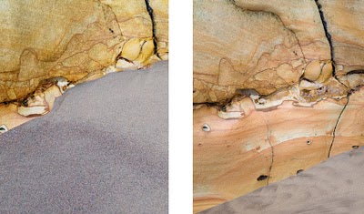
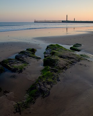
Unfortunately, conditions conspired to make it not the most successful photographic jaunt but a most enjoyable personal trip. The sand was even higher again than last time, probably by about 30cm. You can see from the small pictures below the difference on one section (which wasn’t the worst). The weekend was also gloriously sunny, which isn’t good news for daytime shooting, but was loveley for just wandering around (I even think I got a little sunstroke!)

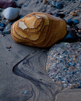
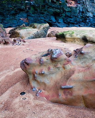
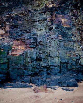
On the saturday we wandered around the beach a little but then decamped to Saltwick Bay which was extraordinary! Between finding ammonites and remains of alum mining, we were also admiring the red sands and the amazing coloured conglomerate rocks. The minerals around this part of the coast have imparted incredible variety of colour into the the boulders, cliffs and bedding. I can understand why this is a mecca for geologists (and photographers!).


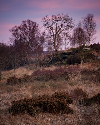
We finished the day off over towards the moors at fen bog with a glorious display of evening colour made all the more intense by the bracken fires that were burning (managed fires I think). I got to use my 360 for the first time, picking off a detail of trees and shrubs against a blue and pink sky. I’d been led to believe that the 360 was difficult to get tilt focus working well but I had no problem at all with it.

I tried a couple of polaroid shots too, one at Saltwick and one at Fen Bog but both were a little unsatisfying. I’m coming to the conclusion that the type 79 effect is an acquired taste and probably only good for certain subjects. This is probably quite good as Polaroid have just cancelled production of all instant films.

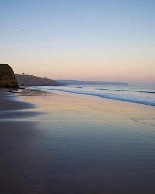
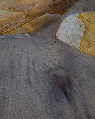
The Sunday finished the weekend with a trip to the beach again to see if the sand levels had changed. Alas not but the colour in the sky was very pretty and fun was had trying to find detail shots with the minimum of material.

One incident still amazes me; whilst I was taking a shot of the shoreline, a dog walker walked towards me (out of his direct way) and then straight in front of my shot, walking all of the clean sand.. He apologised just afterward, saying “Oh I’m sorry was that in your shot?”.. I’d have thought he was just a bit dim if he hadn’t then done exactly the same thing to Mel another 100 yards down the beach. Some people seem to take a perverse pleasure in this sort of baiting. Very strange.

Click to view full post including No Comments
Friday
8 February 2008
No Comments

Exposure Checklist

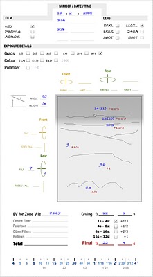
Those people who have only ever used digital cameras will not realise the dearth of meta information a transparency or negative carries. There is no date on it, no exposure data, no camera settings, no lens information, etc. Film photographers have to record all this information for themselves. Large format photographers do not even get the order in which the photographs were taken (sometimes a strip of 35mm can put the information on each exposure in context). So what we do is to make notes.

I tried making notes freehand to begin with but it was such a mess. I can’t write particularly well at the best of times and I’d always forget something. Also, I wanted something that could help me make sure I’d checked everything before taking each exposure.

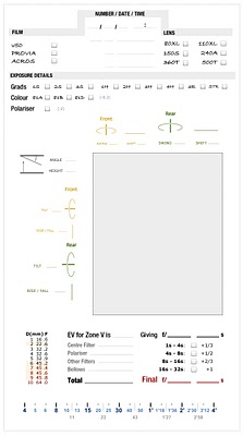
The result is my exposure checklist that I’ve printed out and made into a little clipboard that slips into my Gnass Quickload Pouch. When I take photograph I fill in the details and mark an incrementing number on each quickload. The result is almost organised and it’s stopped me making mistakes a few times..

I also try to make a quick sketch of the scene and mark down some of the important EV readings. In this way I can then double check the exposure of critical shots when I get back to base. I can look at the digital version as well, checking that the result will look correct and judging how blown out highlight or blocked up shadows will be before sending off the first sheet..

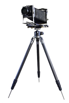
I’m off to Whitby this weekend so I’ll show a sample exposure sheet with my notes. I’m also looking forward to trying out my new tripod. I don’t know if I’ve mentioned but I’ve worked with surveying equipment in a previous life and the use of spikes for the tripods seems to be a given. If this sort of critical task benefits from spikes then I thought photography might benefit too so my new Gitzo 3540XLS has 4 inch stainless steel spikes (which I can swap with rubber feet if needed indoors). The tripod is also bloody huge. At it’s maximum height with the feet on, I can’t attach my Ebony as the ceiling gets in the way!! This sounds like overkill, and on flat land it probably is (although Charlie Waite might disagree); on a sloping hill though, you need two very long legs to use on the downward side and if you are on the uphill side you can still only just stand up.. It’s less than a pound heavier than my current setup and I’d prefer the extra weight to be on the tripod where it can do some good..

The odd thing about the Gitzo is that it smells of old ladies bathing products. A fragrant talc smell that fortunately wears off fairly quickly. Somewhat disturbing though!

Click to view full post including No Comments