Still Developing

" A lot of my enjoyment of photography comes from learning. This is typically done through talking with others, reading books, magazine articles, blogs, etc. Part of the balance of having so much good information available (especially the writings that people make available for free online) is to contribute back by writing anything that I learn or experience. If you get something out of this great. If you care to comment to correct my many mistakes, I would greatly appreciate it. Landscape photography can be a lonely occupation but the conversations we have more than make up for that. "

Tuesday
14 July 2009
10 Comments

A Click of Photographers

Over the past few weeks I’ve been busy (as always) doing either work things or photography related things but not much actual photography, so when I got an email from Jon Brock – who I had been out taking photos with before – asking if I would like to come and stay in Robin Hood’s Bay with him and Dave Tolcher, I jumped at the chance. As it happened, my wife and I were in the Lake District spending the weekend with my Parents at their static caravent just outside Windemere. My Dad likes to come out and capture a few moments so it turned out I was going out twice over the space of two days! (Oh the pressure!).

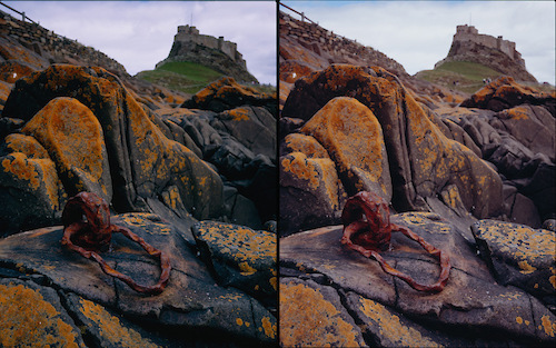
Since publishing my film test results recently, I had been having a few conversations with different photographers, the upshot of which is that there was quite a bit of interest to know if some of the results may have been affected by the company that was doing my E6 developing. Now I’ve been using Peak Imaging so far as they have proved to be the most cost effective and many people I know have been happy with them, but some dissenting voices said that they had had colour issues with Peak. The only evidence that I have for potential problems is when I’ve sent a B sheet off with the same develop settings (i.e. straight development) and the transparencies had slightly different colours (enough to change the tone of the photo). So, one of my challenges was to take a bunch of photos with Astia and Velvia and send them off to four different development labs. The four labs chosen were Peak Imaging, The Darkroom Ltd, NPS Media and I am also sending a pair off to Joanne Carter to hand develop in her Jobo 1500.

So on the Saturday evening my father and I went over to Hodge close, a slate quarry I had seen on flickr which looked particularly interesting. The light didn’t end up particularly inspiring but, with the help of my Parkin senior I took 12 pictures of the following composition (4 Velvia, 4 Astia, 3 Pro 160 and 1 Provia). Hodge close looked amazing though and I have since found someone who has taken a very similar shot to the one I had in mind and which I’ll be returning to take in October/November.. I also got to try out my Avon Skin so Soft “Bug Guard” insect repellant, which Avon have brought out after the huge success with their standard ladies moisturiser (which I hear is given out to the Forestry Commission instead of DEET). The “Bug Guard” includes some insect repellant (as the original component only stopped biting). Good news! Despite a fair amount of midges, the only bites I got were on the top of my head (The repellant is in sachet, towellette form which you don’t think about wiping on your head). It would get more testing the next day however. With a little post processing of the digital photograph I created a quite fetching, ‘Ansel-seque’ black and white conversion which should act as a nice stop gap until I get my real photographs back.

system asset

system asset

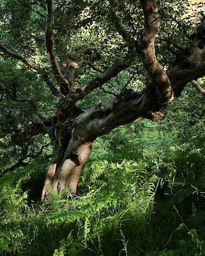
The next day, after a quick drive back to Leeds and across to the Yorkshire Coast, found me walking out on a blistering sunny afternoon with Dave Tolcher and Jon Brock, both large format enthusiasts, to have a look around David’s back yard. We went over to a very interesting beech copse which nestled in a small valley created by a stream as it ran towards the cliff edge. The weather, being particularly inclement at times, had capped the trees growth over the years so that it ended up with many stunted branches. This had the potential for a great shot but with ferns underfoot and no wind, the midges were rising in black clouds all around. Well, the Bug Guard had worked well so far – I figured I would really give it one more test and so set up the shot. With the intense sunlight streaming through the canopy, the sunlight was arying between 8EV to 13EV at the bright spot on the trunk which, at its peak, was well beyond what transparency film could capture. However, as the clouds passed across the sun, there were points where the speckled light was still visible but the spot was only about 10EV. Timing a 2 second shot to overlap some 0.5 second fluctuations was fun – I tripped the shutter just as the light started to fall and hoped for the best. We’ll see the final result but the second shot on the right of this blog post shows the digital test shot. Whilst I was taking this shot, Dave Tolcher was capturing the edge of the copse from just by the cliff edge as can be seen here – a bit too summer green but the composition looks good and the potential for autumn colour looks interesting!

The highlight of the evening was still to come however. With the sky developing some interesting rain clouds and broken light, Jon drive us over to Saltwick Nab and we headed on down to the beach. I was also keen to try out my new boots, a pair of fishermans waders that were specifically designed for mixed wading/walking. The boots are made by a US company called Korkers and, along with a slightly freaky but eminentlly usable ratchet lacing system, they feature interchangeable soles – supplied with a set of standard walking soles and a pair of studded felt soles (see picture below).
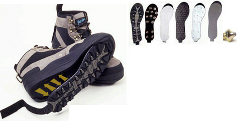
system asset

Well, within seconds of me starting to walk on the Nab’s wet and slimy slate beds I was nearly on my arse so it was time to switch over to the studded felt soles. It only took about a minute to swap the soles over and the difference was tremendous. I was unable to slide at all whilst wearing them and carried on the remainder of the evening without even thinking about my balance or the boots. (the boots do have holes in them and are designed to be worn with neoprene socks or stocking foot waders – it was too hot to try these out though).

There were a couple of photographers when we got there, which I sort of expected. However, as we were setting up, there were more photographers arriving every ten minutes or so. In the end we had 10 photographers around us – including a Mr Mike Kipling (whose photographs from the evening are here). Fortunately, they were all quite polite and we (mostly) kept out of each others ways.

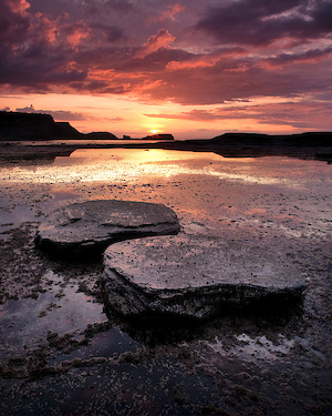
As this was my first time at Saltwick Nab, I didn’t really have a lot of chance to plan what I was going to do. The wreck immediatly grabbed me and being as the first thing I did was stick my head inside it, I thought I’d try some form of close up but – in my usual fashion – trying to put the subect in context. I’m not sure how successful I was and with a 3 stop soft filter and 2 stop hard filter at different angles and a centre filter on, there may be some surprises on the transparency. And then I just couldn’t help myself – I had to take a postcard shot. The whole scene was just too attractive to miss. I even turned the back of my camera the wrong way around (you know, with the long side horizontal). To try to atone for this, I spent the next 15 minutes looking for a composition that may redeem me and settled on a pair of nestling kidneys, choosing to take the shot just as some final wispy clouds caught the deep red rays of the sun.
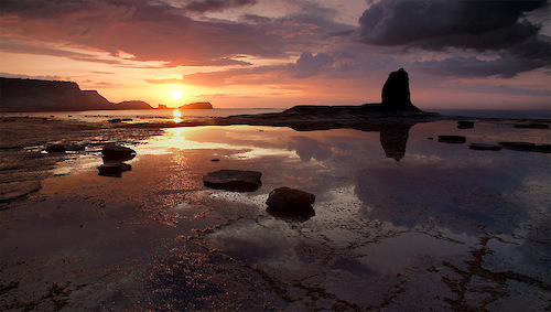
system asset

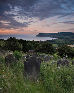
We spent the rest of the evening enjoying a glass of wine and gossiping about photography, book publishing, tennis and finally went to bed.. only I didn’t get much sleep as a scene that Dave had pointed out to me from the top of Robin Hood’s Bay kept playing on my mind. ‘Sunrise’, I kept thinking, ‘Sunrise would be great this time of year’. In the end I didn’t really get any sleep and so drowsily rose around 3.30 , packed up my stuff and drove up to the church at the top of the road out of Robin Hood’s Bay. Precariously balanced on a wobbly stone wall with 3540XLS at it’s full height of 7.5 ft, I managed to capture three shots of the swirling early morning clouds and warmth of the rising sun before I drove back to Leeds, arriving at 6.30 just as my wife got out of bed in time to see me slip into mine for a final couple of hours sleep before work. A big thank you to Dave and Jon for the invite and company!

Click to view full post including 10 Comments
system asset

system asset

system asset

Monday
13 July 2009
5 Comments

Forgetting our Past

When I started taking landscape photographs, everything I read lead me to believe that it had all started with Ansel Adams. Nothing had explicitly stated this but nobody else got talked about much. The I ‘discovered’ Gustav Le Grey and started to realise that there was a history of landscape photography going a long way back. At the same time I also happened upon a book talking about the history of American photography, discussing photographer such as Timothy O’Sullivan, Carleton Watkins and William Henry Jackson. However, the story still seemed a little lopsided.. Where were the UK landscape photographers? I know the American’s had the ‘wilderness’ to discover and most of the photographs were taken as part of surveys with some few ‘postcard’ photographs to show how wild the frontier was but there must have been UK photographers drawn by the countryside.

The name that immediately cropped up was Roger Fenton, he of the cannonballs. However he doesn’t seem to be what we would currently call a landscape photographer and I only found a few examples of photographs of the British landscape. Francis Bedford’s pictures of Wales fitted the bill better, here are a selection of stereo views. However it was a photographer called George Washington Wilson who made me sit up and take notice. He was a photographer by profession, training in London during photography’s infancy, and returned to Glasgow to make quite a success photographing the landed gentry. Fortunately for us, he would also take many trips into the Scottish highlands and islands to bring us back the first steps in real landscape photography.

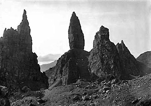
Interestingly Washington demonstrates some aspects of landscape composition that I have recently been talking about. He returns to the same locations again and again, tries different compositions of the same location, developers repeated themes around waterfalls, coastal rocks, overhanging trees, ramshackle cottages etc.. He has also taken some classic ‘iconic’ locations, the most surprising of which is the Storr, with a composition not disimilar to Mr Cornish’s .. (Shown alongside this blog post).

I’ll try to pick a few more of Mr Washington’s photographs, and those of other photographers from the origins of British photography, over the next few months. If anybody has any suggestions for pre 1920’s photographers who took photographs of the British landscape, please let me know..

I’ve pulled together a few different landscape photographs from Mr Wilson and made a little gallery here. Extra bonus points for spotting some more locations..

And finally – I hereby nominate Mr George Washington Wilson to be the official forefather of British Landscape Photography (until I find someone else that is)..

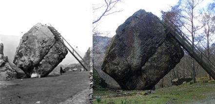
UPDATE: I also spotted this interesting comparison of the Bowder stone in Borrowdale.. Wierd to see two pictures where the second has a new forest in it where there was nothing before..

system asset

Click to view full post including 5 Comments
system asset

system asset

Saturday
27 June 2009
16 Comments
Thinking About Seeing and Seeing Without Thinking

Obsessing as I am about composition at the moment, I thought it a good idea to write a few of my ideas down, hoping that I can bash them into some sort of logical submission.

It was David Ward’s epic post about originality that started my current thoughts. The general background was the phenomenon whereby many photographers visit places they have seen in photographs before and take the same view or visit the seaside at sunset and construct very similar photographs that they have seen in magazines. It made me wonder whether there was something subconcious and/or unintentional happening. I had a feeling that it could be to do with how we ‘interpret’ a scene in relation to our previous experience and our preprogrammed understanding of the world. i.e. Most people only interpret the view that they have in front of them, very few people actually see it.’tree, stream, mountain, grass’ combined with some emotive terms such as ‘stark tree’,’fiery grass’, etc.

Let me explain what I mean by “interpret”. Given a view of the classic dead tree on Rannoch Moor, most people will survey the scene and their subconcious will filter the visual input and pass the following information on to the brain

.. tree .. pointy hill .. rocky stream .. boggy grass .. etc.

The problem with interpretations is that they are informed by our history and our culture and they are so strong that they overpower the actual scene we were looking at. In my post I made a comparison with how we read words on a page. Firstly, we don’t look at letters much; when we read a sentence, we look at word shapes made by ascenders (flk), descenders (jgy), the holes that o’s, e’s and d’s for, etc… and ‘guess’ what the word is. We also don’t actually look at every word if we can guess what the rest of the sentence says. So given a paragraph in a book, we scan these shapes and use our pattern recognition skills to get at the core information.

So what happens when we do actually read a word. I imagine most of us have looked at a word for long enough to start doubting its spelling or even it’s meaning at some point. When we really look at a word for some time, our interpretation mechanism becomes suppressed and we start to see the individual letters and pairs of letters. The problem is, we probably have never done this before (not for a long time anyway) and so the word looks ‘new’. We have a cognitive dissonance between the fact that we know the word very well combined with the fact we are really seeing it for the first time.

This disabling of the ‘interpretive’ part of our brains is an important part of our artistic abilities. To give you an idea how important, you need to read some old books on art appreciation and how artists have gradually moved along a path from symbolic representation. Well I’ve done it for you to save you a little time. The key section that made me really click was in Pliny’s history of art where he recognises Nicias as the first person to paint light and shade Chairascuro) which means that before this point, no-one had conciously realised that a solid had different brightnesses when exposed to light. It’s difficult for us to understand that people did not interpret vision in the same way that we do now. They literally could not see the view in front of them, they were only able to interpret it. When they saw a view or person, their brain processed the view and decomposed it into it’s constituent parts and then they drew their artwork from these parts. Some of the techniques we learn in drawing as children would be revelations to our ancestors. Of course it could be that these acient ancestors knew all about shade and light, perspective and foreshortening but just chose to ignore them all as part of their own ‘personal visions’ 😉

How is this relevent to photography? Well we’re lucky that our cameras do the drawing for us so all we have to do is see the opportunity and realise it. The problem is that we still need to see the opportunity ourselves but how can we do this if we can’t ‘see’ the wood for the trees (It might just be possible that the reason people take so many photographs with digital cameras is that they are not able to see the result until after it has been taken? They are effectively shooting partly blind)

However, just like when we look at a word for too long it stops being a symbol and you start to see the letters and shapes of the letters, when we are out in the field for a long time, we gradually stop seeing the symbols – sun, rock pool, sand, reflection – and will hopefully start to see the real projected space of things and the real colour, like how the sand shifts colour in the shadows and how the curves of two pools meet each other.

A few friends, including Jason Theaker and Rob Hudson, have pointed out that when they are ‘in the zone’ taking photographs, it is akin to a form of meditation. This is something I have also felt, not every time but when I do get the feeling I start to see opportunity everywhere. It’s like the world was some unfathomable whole and gradually the puzzle parts become clear and the solutions available (even if not manageable). This ‘opening’ of your perception is a state of mind that should be our goal. Marcel Proust said “The real voyage of discovery consists not in seeking new landscapes but in having new eyes.” and it is these new eyes that we can unveil by looking harder or more importantly, “looking without thinking”. Another great quote from English Writer G.K. Chesterton “If you look at a thing 999 times, you are perfectly safe; if you look at it for the 1000th time, you are in danger of seeing it for the first time.”.

This state, sometimes called mindfulness, is fairly well known and there is book called ‘The Tao of Photography’ that, judging by the first chapters which you can read on google books, will make for an interesting read on the subject. Although it only talks about Mindfulness in a couple of places, the whole concept is very much oriented around the Zen practise of just ‘being’, just ‘looking. (seeking mindfulness however is not mindful – damn!).

So what we, as photographers, do when we are in this altered state is to capture a view of our environment that the general viewer would overlook. If we can overcome our initial gestalt perceptions, we bring a new way of seeing to our audience.

However, we can also use our new found knowledge of how perception works to create better works of art. There are various perceptive capabilities that our eyes/brain have that allow us to infer extra information from the view in front of us. Most of these capabilities are to do with making decisions on insufficient information – for instance, we will infer the remainder of a shape where only it’s edge is showing (obvious survival benefits here – human: “ooh is that a bear behind that tree!”, bear: “gestalt, schmestalt!… dang”). I hope to expand on how you may use knowledge of your viewers perceptive abilities to create better compositions over the next couple of weeks. For now, I’ll leave you with an interesting observation about leading lines in photography.

When viewers ‘scan’ our pictures, they do not do so in a linear fashion i.e. their eye does not follow a linear path across a picture, absorbing content as it goes. Instead, our eye jumps in small movements called ‘saccades’ and then rest for a moment if there is something ‘interesting’. The resting points are called ‘fixations’. It turns out that our eyes ‘cannot’ smoothly scan from one part of a picture to another. However, if there is a line feature in our picture, it gives our eye a continuous progression of fixation points to follow and, subconciously, our eye prefers to follow this than to skip onto another ‘unknown’ part of the picture. Also, when your eye is in its ‘saccade’ state, your visual system is suppresed (although not completely shut down) so that you don’t really ‘see’ anything in between fixations.

Another perceptual nuance is our ability to ‘fill in the blanks’ (Gestalt Theory’ law of continuity) when we see a broken shape or line e.g. if we were to see a partial or broken line, our brain creates virtual ‘filler material’ where the gaps are to produce a full shape, also strongly preferring primary shapes, lines, circles, triangles…

Combining these two perceptual features together, we can start to understand just what leading lines in pictures are doing. The core ‘sharp’ focus are, our fovea, only covers a couple of degrees and saccades can typicalluy cover about 15-20 degrees but typically only traverse about 4 degrees. So our eye either takes a big jump across a section of the picture, not seeing anything in between (Try viewing this video and try really hard to count the number of ball passes.. once you have done so, click here), or they can follow a line in the picture (real or gestalt) and absorb the features along that path. When our eye gets to the end of a line, it has to ‘jump’ somewhere, either back to something it saw on the line previously or possible to an area of high contrast or interest – remember that your eye does not see detail outside of the fovea so unless you have some strong feature in your picture, your eye/brain won’t have anything to be attracted to.

So we can now explain leading lines, strong fixation points; we can even assume that those ‘dead’ areas people talk about in critiqueing pictures are where the eye can’t gets to via a leading line and that have no strong feature to trigger a large saccade to.

Obviously we wouldn’t want to be thinking about all of this as we are looking for pictures, but it may be useful to bear this in mind when we are doing our final checks. You should try to see the picture as if for the first time and follow the suggested lines. Do they lead out of the picture or do they keep the flow of the eye moving within? When a line ends, is there anywhere for the eye to go? Does your eye get caught in one part of the picture?

The subject of perception and art is one that is fascinating and slightlty scary. As much as I want to know more about how the eye works, I really don’t want to ‘pollute’ my mindful eye. All of this is interesting knowledge and is of some use when critiqueing pictures but our ultimate goal should be to allow these concious thoughts about composition and balance to become part of our subconcious, allowing our own impulses to mingle with our compositional skills to create somethig uniquely personal.

Click to view full post including 16 Comments
system asset

Saturday
20 June 2009
2 Comments
Half Shade and Timing

When I started using my large format camera, one of the early tests I made was on the effect of shade on the look of pictures. I had taken a few pictures with my digital camera where the foreground was in partial shade and was intrigued by the how it gave a depth and colour that was surprisingly vivid. When I was taking one of my first large format shots I decided to try a couple of extra shots just to see how much difference getting that critical moment made.

My instinct told my that the best momet to take the picture was just as the shade was opening up and with a sunlit background. Well you can see the results for yourself. The picture taken just before this critical moment is dull and lifeless; the picture taken just afterward is starting to become burnt out and has lost colour and depth; the critical moment gives a picture that has soft, open colour.

The reason for this, as far as my understanding of lighting is concerned, is that when you you have light transitioning from behind the cloud you have a combination of diffuse light and direct light. During this time you have the opportunity to balance those two sources of light, just like you would do manually in a lighting studio. Typically, the background will benefit from direct or only slightly diffuse sunlight because the harsh lighting doesn’t have as great a negative impact at a distance.

Two of my favourite photographers have said that experience in a photography studio gave them an insight into how lighting works and this knowledge was particularly useful in the field. We don’t have control over lighting sources in nature but learning to predict the different effects the atmosphere can have on our primary spotlight can help us make the most out of our subject matter.

I’d be interested in hearing any other observations about how the to use the atmosphere to create stronger pictures.

Click to view full post including 2 Comments
system asset

system asset

system asset

Saturday
13 June 2009
29 Comments
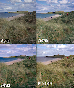
Fuji Velvia, Provia, Astia, and Pro160

If you’ve arrived from Ken Rockwell’s site then welcome! I’m currently comparing a whole load more films, in fact every colour film available in 4×5 sheet form. If you’re interested in the results, subscribe to updates and you’ll get notified. I’ve another couple of interesting projects soon too.. more later though. Subscribe here if you want to.. Oh! And a big thanks to Ken for the link :-)
One of the things I have been trying to learn over the last two years of using film is how the different types (at least quickload types) render colour and tone? Which film should I use in which circumstance and which film should I just ignore. I’ve mostly been using Velvia and Provia but recently I picked up a box of Pro160s (prior to my Northumberland Light and Land trip) and a few boxes of Astia from the US (at considerable cost unfortunately).

The majority of landscape photographers that I admire use Provia and Velvia (sometimes 100) and Provia only infrequently. However all of the ‘art’ landscape photographers use Pro160s (or Portra) and possibly the less saturated transparency films like Astia. I don’t like taking things for granted though, I’d rather see for myself (even if the results are as expected). So, over the last few months, every time I have had the opportunity I have taken a picture with alternate films of subjects that I hope will show some of the differences (especially at extremes of colour and light). In this post I’ll show all of the pictures and discuss my interpretation of what I am seeing. I’ll also try to emulate each film by adjusting the results to compensate to find out if I can make Provia look like Astia or Pro160 look like Velvia (as if!)..

Lets take a look at Velvia and Provia to begin with as these are the most commonly used transparency films in large format. I’m using the new version of Velvia and most of the pictures have been taken at the rated iso 50. You can click on any image to get a larger view.

system asset

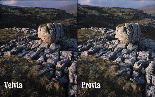
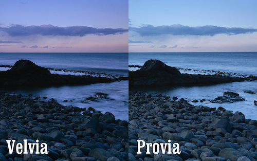
This is a shot I took in the Yorkshire dales with scattered clouds on a blue sky. This isn’t taxing either film particularly. The colours are fairly low in saturation and the contrast isn’t extreme. The differences here are fairly subtle but here are the main ones

  • The overall look of the provia version is fairly cyanic
  • The provia is less saturated than the velvia.
  • The whites of the clouds look slighly magenta on the velvia version.
  • The grass in the velvia seems to have a shift to blue/cyan and is darker – definitely more realistic grass in the provia

Interestly we see two different effects here. The overall cyan cast and yet the grass is definitely towards the orangy red. To correct the Provia you would probably have to add a warming filter and then cool the greens back down again.. However, having tried this I then ended up with muddy blues on the provia transparency. The relationships are complex even here.. Overall however, Velvia seems to separate out the magenta, blue and green components of the picture and the greens > blue, whites > magenta. Provia has less colour separation and has an overall cyan tinge, however the greens seem to be least affected by this; Provia has little of the intense sky blue separation seen on Velvia.

system asset

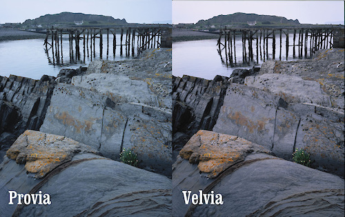
This is taken on a very hazy spring day in Scotland where there was a strong visible blue/cyan cast to the world. Because we’re operating in a smaller spectrum of colour, we start to see the difference in film behaviour more strongly. The main differences..

  • The provia is intensely cyanic
  • The velvia has offered a fairly neutral colour although does carry an overal very slight magenta colouration
  • The yellows in the provia are almost acid wheras Velvia has given a rich orangy yellow (more natural to this lichen)

This time the Velvia would be the obvious choice to render a colour accurate picture in these conditions (which goes against instinct). Both films behave sensibly in the shadows (i.e. no extraenous cast)

system asset

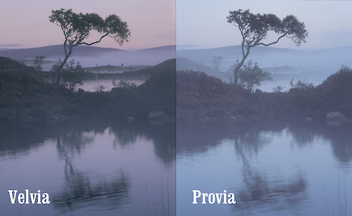
Here we have some very low contrast levels on a dawn on Rannoch moor about 15 minutes before dawn. The contrast range must have been only about +/- 2 stops at most (although some patches of dark probably go -3+). I exposed the frames about mid way so the highlights are a nice +1 2/3. So, to the differences

  • The provia shows a strong cyan cast again, especially in the highlights. However, I think I can see a magenta tinge to the shadows.
  • The Velvia is strongly magenta in the midtones and highilight but with a shift to green in the shadows,

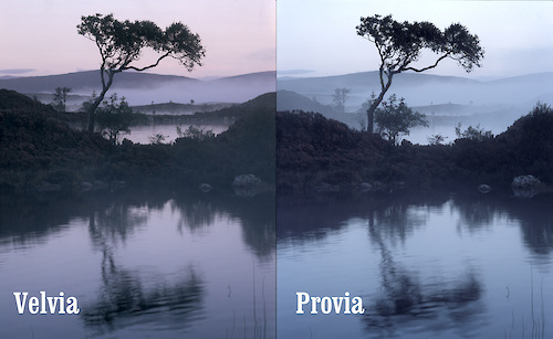
Here is a version with the Levels adjusted to fix the black points..

system asset

Here you can see the colour cast in the shadows a lot clearer.

system asset

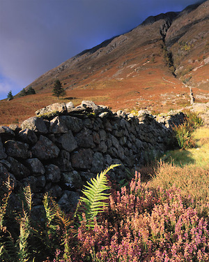
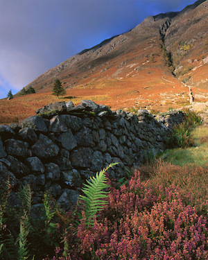
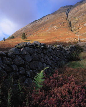
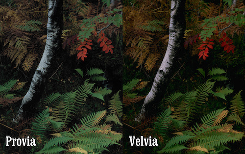
Here is a picture full of bold colour. It also shows some interesting ways in which Velvia treats reds and greens. The reds in particular are increased in contrast. If you look at the red leaves, the slighly darker colours in the red leaves are much darker in the velvia transparency. The digital file of this picture shows a lot more yellow in the ferns and the provia is closer to this – I would probably say that the provia is closer to the actual colour. The digital picture also shows that the reds don’t go as dark as in either the velvia or ther provia. I think red response falls off very rapidly so reds will tend to be either dark or light, maroon or intense pillar box red. So in summary

  • On velvia reds roll of in lightness very quickly, dropping to maroons
  • Velvia has strongly saturated shadows as opposed to provia where greens can become quite muted in the shadows and also show a warmish shift..
  • Definitely more open shadows in the provia

system asset

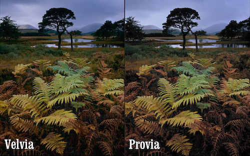
Here is a well exposed picture (at least for me) and it doesn’t show any extreme casts. The provia cyan is till there and we can see the warm greeny blues in the vegetation shadows. The dark red ferns in the provia are almost maroon wheras in the velvia they are a warm orange. Definitely a win for Velvia here..

system asset

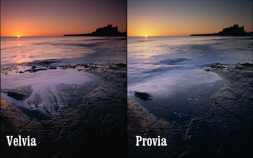
Here we can see the classic velvia sunrise colouration. Provia is behaving very differently here.. It has an intense cyan colouration which needed a strong red filter to bring things back to neutrality. Unfortunately a basic red filter also screws up white balance and destorys some of the green colours. The Velvia has created dark magentas in the sky wheras Provia has turned a deep midnight blue. The truth, again, was somewhere in the middle.

Again though, the films are behaving strategically – colour by colour. This isn’t just a magenta cast and stronger contrast. Almost all colours and shades have their own independant colouration. This is really what makes velvia so special, there isn’t a simple conversion you can apply to a neutral image that will reproduce it. Velvia does respond well to a cyan cooling filter when you have intensely coloured light like this. I’ve tried applying the appropriate colour changes to the different parts of the image knowing that theoretically it’s possible to convert a Provia slide to a Velvia slide. However, it isn’t possible and I think I know why.

Quick side trip into destructive transformations. If we have three colours.. Blue, Green and Yellow and we take two theoretical films.. The first (A) has an affinity for blue and greens tend to look blue but yellows look ok.. Our second film (B) has an affinity for Yellow and greens tend to look yellow but blues look ok. So .. if we wanted to transform film A into film B, what colour do we convert Blue into? Green or Yellow?

Anyway, back to film comparisons..

system asset

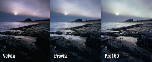
Here is a photo taken on a cool morning in March. We’ve got no real surprises on the provia and velvia front but we’re introducing Pro160 now. As far as I can understand it, negative film cannot be consistently converted as the different orange masks vary or development is more sensitive or something (someone could explain?) but I’ve kept the conversion parameters in Silverfast consistent so hopefully we have a representative of what could happen. Pro160 is obviously a lot less contrasty but one of the interesting things we can see here is the separation between the cyan and magenta combined with an overall yellowy cast..

system asset

More Provia/Velvia comparisons…. nothing new here (unless somebody can see something interesting?)

system asset

And here is an example of how different conversions of Pro160 can be dramatically divergent.. I obviously need help (DAV!!)…

Astia!

And so on to Astia.. I bought three boxes and an excessive price from Badger Graphic in the US (it isn’t available in Europe any more) and went through a box in comparisons whilst on a family holiday in Northumberland. Well, my opinions are mixed but I’ll start showing you the raw material

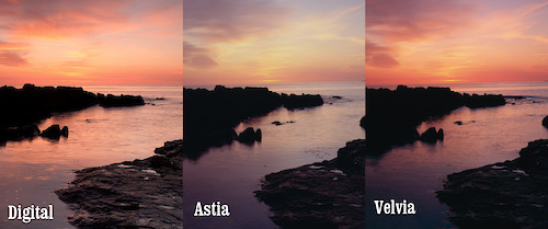
Well start with a comparison between Velvia and Astia (with the original digital file for comparison)

system asset

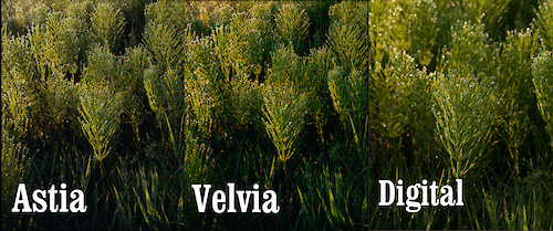
The first thing we see is that the Velvia is more colour accurate than the Astia (compared with the digital anyway). This was quite a surprise! I expected, with all I had heard about Astia, that it would be very close to life like. In fact it seems like, with vibrant colours at least, astia has a strongly unsaturated look and feel with a slight yellow cast. Another surpsise is that it seems to have a magenta cast in the shadows (unless Peak Imaging are having ph problems). That said, I like the pallete of it. I like the way it has created a water colour like feel. I think that where Velvia separates greens and magentas strongly, astia separates yellows and blues (just a theory yet). Here is another comparison of the whole sky once the sun had risen.

system asset

oops… I made a velvia/provia comparison and forgot the astia.

system asset

This picture at least shows the green shadows in Velvia and the Magenta’ish shadows in Provia

system asset

Quite a green comparison here. We can see the classic bluey greens of the Velvia and the Astia has a lack of saturation in the green although keeps a strong yellow component. This makes for a dried out, desert feel to grasses (compared to the rich lushness of the velvia look – which is probably why summer greens with Velvia end up wierd; combine the natural increased blue component with summer foliage and the bluey cast of green colours and you get something quite alien.

system asset

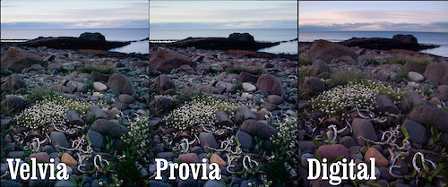
flowers! Here is a nice subtle shot to compare responses. I can see the yellowy cast in the astia, the blue greens in the velvia and a cyan in the provia. The colour in the digital looks a little too yellow from what I remember which I see quite often in digital greenery (obviously too many green sensors).

system asset

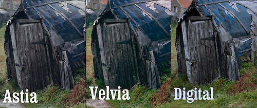
These huts show some wierdness in the blues.. I know the tarpaulin wasn’t greeny blue of the digital and it wasn’t the royal blue of the velvia. In this case the astia seems most accurate although the magenta shadows don’t look realistic – then again neither are the green shadows in the Velvia.

system asset

This is a comparison across all of the films I’ve been using. You can see quite clearly here the dramatic separation of blue and magenta cast of the velvia. The provia is looking pretty neutral if slightly cool. The Astia has the same ‘parched summer’ look with some magenta in the dark areas (check the water colour). Pro160 looks quite good but I can never get a nice compromise between too much green or too much magenta – here I’ve gone slightly magenta in the mid tones. Finally, the digital just looks a little alien; the blue clouds and intense yellowy green shadows (in the grass) don’t look natural to me, although it does get the water and beach pretty spot on.

system asset

This shows the magenta or green shadows in astia and velvia and the yellow in the astia overall. It also shows the increased dynamic range of astia in comparison to velvia. Finally it also shows the horrible peachy sky that you get with digital combined with the hideous yellowy greens yeuch…

system asset

Here is a dramatic image showing the magenta/green differences between astia and velvia. It also shows that astia has got the sky pretty right. Look at the greens though! Velvia looks spring like whereas the Astia looks like the end of summer..

As the sun goes down…

system asset

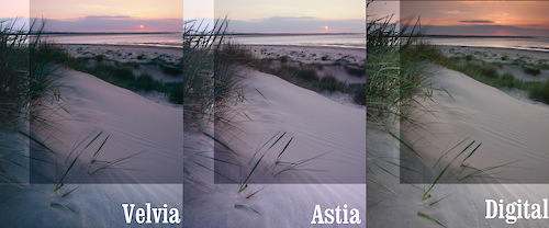
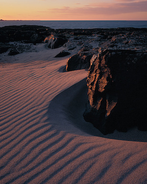
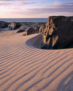
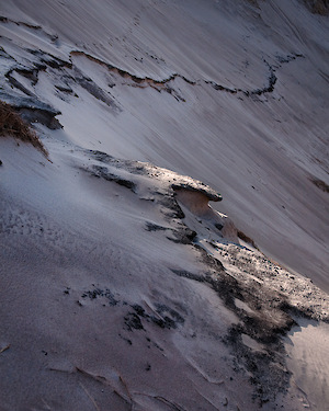
This one confused me.. The sand doesn’t change much between shots but the skies are sooo different (note that the digital ewas taken in shade so it isn’t a good match for the others really). I can’t manage to discuss these pictures too much as I’m all analyticaly burned out… I’ll leave this and the final picture for you to tell me what you see.. These last transparencies are very underexposed (the velvia not so much so).

system asset

I hope that leaves you with a good impression of some of the differences between the main large format films being used by landscape photographers in the UK. I would like to try out some Kodak film at some point too. As a final point, it has been said that some of the colour casts I’m seeing may be to do with my processing lab (Peak Imaging) not having their developer at a consistent pH. The next test I am going to try is to send a few of the same shot to different developing labs in the UK. Hopefully this should provide a measure of how consistent we can expect lab processing and how to recognise what is film colour influence and bad processing colour influence.

Please help me by providing your own interpretations of what you see here. The more I can get to know the characteristics of these films, the better I can predict what will happen when faced with a new picture.

UPDATE: Here are some links to other online comparisons…

Provia vs Astia long exposures

UPDATE: I’ve been using some newer profiles so please take a look at the following page which shows how Astia should look when scanned properly :-) click here for a review of profiled scanning on a v750

Click to view full post including 29 Comments

system asset

Wednesday
20 May 2009
6 Comments

Family Holiday in Northumberland

Going on a family holiday is a stressful time for a photographer; Working out how to balance time between family and photography can often lead to unstaisfaction for both parties. In addition to that, quite often family holidays tend to occur in the summer months when sunrise times are particularly unreasonable, there are too many people around and clear blue skies (if they happen) are fine for non photographers but useless for us. So, how can you make the most of this time? Well, the best thing to do would be to put down the camera and just enjoy the experience, but as most of us are obsessive compulsives by nature I think this is probably unreasonable. My personal solution, whilst on a family trip to Northumberland, was to bite the bullet and get up stupidly early for half the mornings and then explain to the family that I would be dissapearing about 8.30 to get a few sunsets in. If I got up at 3.30 I could be back in bed for 5.30 and get the second half of my 6 hours sleep!

So how did this work in Northumberland? Well the one disadvantage of this is that you don’t get much time to scout out areas so instead of trying to cover as much ground as possible I decided to stick to one area, which was easily accessible by car, and work my way around it. I decided to only visit the end of the Wynding and Budle bay as the sun set just opposite Budle bay to the left of Holy Island (see evening shot in gallery for example – link at bottom of this post).

The Sunsets

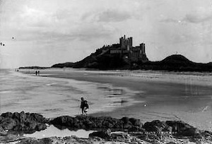
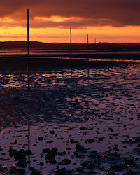
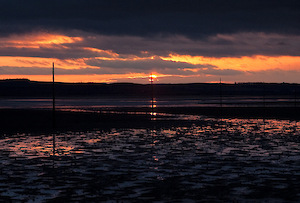
Budle Bay is a mile walk from the Wynding down to Budle and back again wth a few areas of geological interest between. The first evening I walked fairly aimlessly around the dunes in Budle and was dissapointed that the sand was mostly trodden over and the pictures I took were a little disappointing. I did manage to get a photo of Bamburgh’s famous fighting caterpillars though! (see below). It was only on the final night that I found a clean area, a subdued sun and a composition that gave me the feeling of the area (See picture below).

The main issue I was getting was footsteps in the sand limiting my options. However, on one evening the wind was blowing a gusty 20mph and had managed to shift quite a bit of sand against some of the nice rock features just past the end of the Wynding. The mini sand dunes that were created reminded me the larger African dunes and I decided to try to create something that brought out this foreign feel. I had to work very low (burying my tripod in the sand in an attempt to get the rocks above the horizon) and was covered in sand at the end of the process but I hope the result works.

One of my goals during the holiday was to use less film, to try to capture each shot in only a single sheet. This, combined with my other goal of comparing Astia, Velvia and Provia (to be featured in my next blog entry) meant I only had time to work with two compositions and I think I slightly overexposed the first and underexposed the second – ah well, these are the lessons I wanted to learn by only taking one shot..

The Mornings

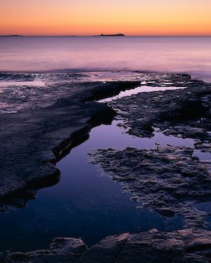
I had a bit of success on the second of my morning outings where I was rewarded with a beautiful orange, blue, yellow pink and purple pre dawn glow. Unfortunately I couldn’t find anything to create something with a strong compositional structure and ended up using the shapes of the rocks to introduce some visual movement through the frame. I suppose I could say that “It’s the colour stupid!” but that would be a cop out – I really just let nature spray pretty colours onto my film.

The Family Outings

I did take the camera out with me to a couple of locations, once to Dunstaburgh and once to Holy island, and managed to sneak off on a couple of occasions to take a ‘big picture’. The first was of Holy island itself with one of it’s mooring links in the foreground (hardly original compositionally but I did like the structure of mid ground rocks as mini mountain range). The second was of one of the upside down boats (the one with the semi-famous green padlock) where I found the only composition that allowed me to exclude the Bank Holiday milling minions.. The result is a picture I really like for it’s portrayal of the shed but that is ulimately unbalanced because of the very close cropping I ended up making.

Our Dunstanburgh day out was a walk from Embleton, across the dunes to the castle and back again. We stopped next to Saddle Rock and I found an abstract composition of the lichen and rocks which worked really well on digital (although the large format version didn’t work as the tide had dropped and the white line of the surf edge. I was also tempted to get a shot from behind the castle over the lake but the light failed and my feet were getting tired..

The only other picture I took was on a bored evening when I decided to play with “floral” shots in the garden. The result should do niceley for a birthday card or two :-)

Conclusion?

So was trip a photographic or family success? Well I spent most of the time with my family and didn’t let photography get in the way, but I also spent a few mornings and evenings on my own working around some ideas I had been thinking about and experimenting with different films. Most of my exposures were within half a stop ofcorrect but I sitll need to get better. I’ll be taking B sheets for important photos still I think. Also, the main photograph was a little dissapointing as the effect I was after only really worked on the SLR shot – the picture is still strong, but not quite what I was after.. I need to think more before I take a shot..

I’ve included a little web gallery of my SLR notes from the mornings and evenings I was out. Check it out here

update: I’ve added a second version in the sidebar which I think better captures the composition I wanted but not the light. I also wanted to get the camera down lower so the peak raised higher above the water line. What do you think? Should I have waited to combine the two?

Click to view full post including 6 Comments

system asset

system asset

Monday
18 May 2009
12 Comments

Last Day in Northumberland

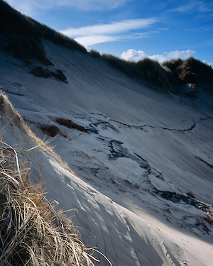
On the very last day of our large format course we went over to Budle Bay to take a look at the sand patterns (and possibly take the odd photo). While Joe and a few others went over to the see pools created as the tide went out, myself and Paul Arthur went up into the dunes to try to capture some of the shifting sands. The main pictures are of an old peat layer that is gradually being revealed by the erosion. I went back to this location a few months later and the whole structure of the area had changed. That evening also saw a wonderful sunset – that I spent taking stupid pictures of the water. However I did get a nice picture of the sand patterns which were unlike any I had seen before (it reminded me of snake skin).

I really enjoyed the large format course and it felt like learning from friends rather than being tutored. I highly recommend the Light and Land large format courses, both Joe and David have an enormous amount of experience and you couldn’t have a better starting point for a journey into large format than this.

Out of interest, I’d be interested in knowing which of the pictures in the sidebar you think I should include in my main gallery? I’ll say which I prefer after I’ve got one or two comments..

Thanks for reading and sorry for the slow posting – I’m getting back into regular swing of things now and promise to post once a week from now on.

Click to view full post including 12 Comments

system asset

system asset

Thursday
16 April 2009
2 Comments

Landscape Photography with Roger Dean

The Thursday started badly with me being so tired as to sleep through the alarm clock. It would be the day when we have the best, deep frost with frozen sand and hoar frost on the marram grass (see here for an example of what a talented photographer can do with these conditions).

After everybody getting back for breakfast and told me how great the morning was (b*s) we ate, packed up and set off for Holy Island.

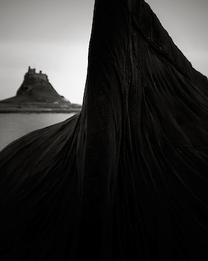
Our first port of call was the ‘inverted boat’ sheds and people were instantly drawn to the peeling paint on the boats. I was hoping to get a shot that represented the place though; something that summarised where I was. The obvious subject matter was the boat sheds and the castle but I was also drawn to the black tarpaulins that were used as a skin for the inverted boats. Despite being black, there were amazing textures within where the tarpaulin draped around the boat and was pinned to the wood underneath. After walking around two of the better looking boats-sheds, I noticed the similarity in shape of holy island and the outline of the top of the shed. After a couple of test shots on the 5D I set up my camera with the majority of the frame taken up by the boat but wth the island nestling in the background.

The sun was high and bright and I knew I wouldn’t get a good colour result (although I did try). I used Acros 100 in the end and the main shot is the result.

On the way back Joe had predicted “A band of clear sky opening up at the horizon that should coincide with the sun setting. Should give us a nice view over St Cuthberts…” The man is a meteoroligal fortune teller! I think I must have set a new record in the speed in which a large format camera can be set up.. Only five minutes between out of the van and first shot … AND it was focussed and exposed correctly (bloody lucky!).

The shot isn’t exactly a compositional masterpeice (there is only so much you can do given the subject) but I like it.. I’m still waiting for a final picture to come through which should have some nice side lighting of the sand and grasses.. At the end, just before we left, I spent a few moments trying to come up with an overblown sunset shot – David was comparing the view with Roger Dean’s YES album covers – and captured the shot shown below.. it won’t win any awards either but it’s a great reminder of a wonderful sunset..

system asset

system asset

Click to view full post including 2 Comments

system asset

Saturday
4 April 2009
1 Comment

Spot the Castle

Monday evening was the official start of the course and it was time to get to know a few people. A pleasant surprise for me was seeing Dav Thomas turn up, someone I’ve been out shooting with previously and who’s company I know I enjoy. The rest of the participants were the usual eclectic mix apart from the fact that there was a distinct lack of women (although Mr Ward did turn up in a dress on the second night!*). Anyway, after the usual introductions we retired to bed ready for a busy day. Tuesday was mostly reviewing how the equipment and despite a trip to Seahouses, I didn’t take any photographs as I was helping other people where necessary. The main issues seemed to be how how to approach focusing with the view camera depending on what type of focus is needed. I’m going to try to write my own guide to this process which will be completely opinionated but maybe of use to someone (I’ve already started on this but got stuck when trying to work out if front tilt really didn’t distort the picture).

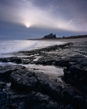
The photography started in earnest on the Wednesday however. Our first port of call was back to the Wynding for a sunrise in front of Bamburgh castle. Me and Dav were typically contrary and ran away from the obvious viewpoint to have a look closer to the castle. However, after taking a very distant view of Holy Island (behind some grasses) I decided to walk back to the starting point. A brief stop for a quick shot of some colour in the water and I was back with the gang again. The sun had failed to produce anything particularly amazing when it broke the horizon and quickly wandered behind a dense wedge of dark cloud. I was walking around talking to a couple of people and started to notice the sun trying to fight out of the top of the wedge and in doing creating a particularly cold, winter light (including the hint of a sundog or parhelia to be correct). I was already looking at some of the dark volcanic rocks and particularly at the way an inlet was providing a line that continued the radiating arcs of waves and seaweed (all radiating from the middle left of the main shot). The final composition worked as a big zig-zag from bottom right to lower left to middle right to upper left..

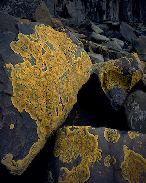
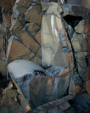
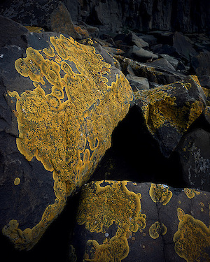
With two out of my last three shots being cliched renditions of Bamburgh castle, I was determined that the remainder of the day would produce something a little different. Our next location was Cullernose point where I very quickly found some wonderful areas of yellow lichen (shown to great effect in Joe’s Northumberland book). Thinking about Joe’s work and his fascination with geometric forms must have drawn me to the triangular black hole in the centre of this set of lichen covered rocks. With bright sunshine, this wasn’t the best conditions to be taking abstract rock pictures but there was the occasional lull in the light that softened the shadows a little. I made the most of one of these occasions to take a ‘work in progress’ picture of this patch of lichen and also a photograph of some of the incredible colours and shapes of the cliffs nearby (the chair shaped picture below). This area is particularly hard to work in with it’s large irregular shaped boulders but with my recent balance issues (caused by Labyrinthitis) I don’t think I made the most of the situation (excuses, excuses eh.. ).

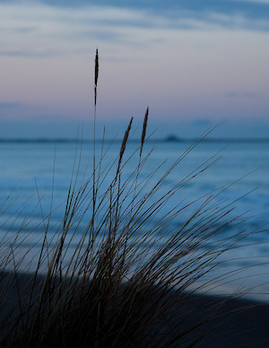
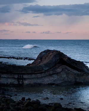
Our final location of the day was down to Dunstanburgh castle where I worked hard to avoid the obvious ‘big black boulders’ shot by taking a picture of some marram grass and, finally, a photograph of a stretch of folded strata beneath the black basalt of Gull Crag (see Paul Corica’s article on the geology of Northumberland here) . Whilst looking at this outcrop of rock and wondering at the stupendous timescales and pressures that must have created it, I realised that the waves rolling sometimes formed immediatly behind it. Of course by the time I had my camera set up it was another fifteen minutes or so before the next wave obliged.. By this time it was getting cold and I was being chased back to the van by David where, amazingly, it was just starting to snow.. The end of a productive day was concluded by a brief ‘show and tell’ where Paul Arthur and Paul Mitchell showed us some wonderful photographs..

p.s. This bit isn’t quite true..

system asset

system asset

system asset

system asset

Click to view full post including 1 Comment

system asset

Tuesday
24 March 2009
5 Comments

Bamburgh Start

And so .. on to Northumberland.. as you probably have read, my mission to Glencoe was abandoned (after seriously getting my hotel bookings wrong for Nigel Halliwell and Adrian Hollister – sorry mates!). But there was no way I was going to miss Northumberland as well so even though I was feeling a little bit wobbly I was picked up by David Ward on the Sunday and myself, David and Paul Arthur were on our way. We did get a little tense when we saw the most amazing skies on the A1 on the way up and we had to revert to that old photographer standard ‘Nah, it’s crap, wouldn’t work. I’ve seen better. You don’t want to take sunsets anyway.’ whilst clenching teeth and muttering. We arrived after dark, brought our stuff in and had an early night in preparation for a bit of “pre-course” photography.

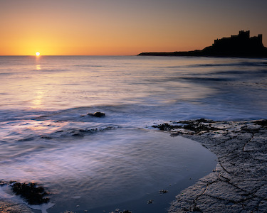
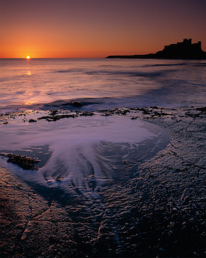
For the first dawn we took a leisurely stroll over to the beach at the start of the Wynding and took a couple of shots of “The Submarine” and of Bamburgh castle (I tried my best not to include the castle but I swear it sucks your camera toward it..). As it was a clear morning, I was looking forward to playing with the low skimming sunlight across the water, hoping to capture some of the gossamer threads of light that I’d seen in a couple of my other medium length exposures of the sea with sun. My first exposure was too long to capture any of this at over 20s but I really wanted to get a shot of the HMS Farne Island and the foreground ridge with it’s angular rock pools. My ‘successful’ composition was the castle shot but I’m hoping that it works because of the shapes of the wave shadows (the sun was so low that the peaks of the waves cast shadows) and the shapes of the foreground foam continue and mirror each other.

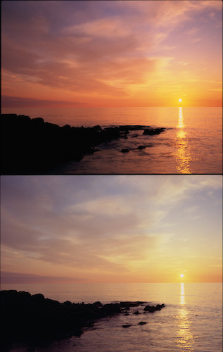
A little known fact of some use to landscape photographers is that the sun takes between 2 and 3 minutes to go from touching the horizon to completely over the horizon so now you know how long you have once that speck of light appears :-) In my case I had enough time to take a second exposure on Provia which I’ve cropped and included below. The colour difference is quite striking.

What did I learn out of these shots? Well a couple of the main lessons for me are that to capture movement in the water in a way that doesn’t end up as fog and yet doesn’t freeze action needs a shutter speed of between 1/2 to 2 seconds (depending on how close you are I suppose). I love the effects of the light in the water if you look closeley at the main picture and would like to feature these effects as a central motif in a picture sometime. The other lesson is that, again, I need to simplify my compositions more. The submarine shot is nice but it doesn’t have a pleasing graphic composition, it’s all jerks and stutters. The last lesson? I love the seaside! Water is a fantastic subject and one I need to spend more time on..

system asset

system asset

Click to view full post including 5 Comments

system asset